
📸 Pixel to Print – Part 10: From File to Fine Art – Your Onward Journey
The thought of printing can be intimidating, but transforming your digital image into a stunning physical print is a rewarding skill. This technical guide covers essential steps like monitor calibration, understanding resolution, and matching aspect ratios to ensure your print looks exactly as you intended.
“A photograph isn’t finished until it’s printed. But it’s not just about the print. It’s about the process of discovering what your work can truly become.”
As we reach the final post in our Pixel to Print series, we want to take a moment to reflect, celebrate, and look ahead. Printing isn’t just a technical skill—it’s a creative act that completes your photographic vision. Whether you’ve printed one photo or a whole portfolio during this series, you’ve already taken a huge step many photographers never do.
Let’s recap what you’ve learned—and what you can do next.
📚 What We Covered in This Series
· **Part 1: Why Print?**
We explored the emotional, artistic, and practical reasons to print your photos. Prints invite us to slow down, connect, and give our work the permanence it deserves.
· **Part 2: Interview with June Cook FRPS**
June shared her personal printing journey, from early experiments to exhibition-quality prints. Her advice: just start. Let your love for the image lead the way.
· **Part 3: What to Print**
You learned how to select images with strong emotional resonance, storytelling value, and technical quality. Not perfect images—meaningful ones.
· **Part 4: Preparing Your Image**
We got technical! Resolution, aspect ratios, soft proofing, sharpening, and file formats—everything you need to prepare a print-ready file.
· **Part 5: Home vs. Lab Printing**
Whether you print at home or use a lab, we weighed the pros and cons to help you decide what suits your workflow and goals.
· **Part 6: Choosing the Right Paper**
Glossy, matte, Baryta, fine art—each paper tells a different story. You learned how to match paper choice with your image style and emotional intent.
· **Part 7: Colour Management & Soft Proofing**
We covered monitor calibration, ICC profiles, and how to preview exactly how your print will look before wasting time and ink.
· **Part 8: Mounting & Displaying Your Prints**
From club competitions to gallery walls, this post helped you showcase your prints with confidence using mounts, frames, and presentation tips.
· **Part 9: Printing with Lightroom**
We wrapped up the technical workflow using Lightroom Classic, giving you step-by-step guidance to print your images cleanly and accurately.
🎯 So What Now?
You’ve got the knowledge. You’ve got the tools. Now it’s time to keep printing.
Don’t let your images stay trapped in the digital world. Set yourself a new challenge:
🛠️ Action Step 1: Complete Your Print Journey
This week, choose one photo—just one—that means something to you.
Prepare it. Print it. Mount it. Display it.
Then share it with someone:
- Bring it to the club for our Member Showcase Wall
- Submit it for a future print competition
- Hang it in your home or gift it to a friend
Let your photography take up space in the real world.
✅ Action Step2: Print Critique
Next week, browse though your back catalogue of images and identify 6
Prepare it. Print them.
Bring them to the print photo critique.
Enter two in to the club competition.
👥 Join the Print Conversation
This series doesn’t have to be the end—it’s the beginning of a new way of seeing your work.
We’ll be continuing to support printing at the club with:
- Printing Workshops – including mounting and soft proofing demos
- Print Buddy Pairings – team up with a fellow printer to share tips
- Showcase Wall – ongoing space to share members’ prints at club nights
- Print-Focused Critique Sessions – new for next season
Got questions? Want to show us your first print? Reach out!
🧵 Final Thoughts
If there’s one takeaway from this series, let it be this:
“Your photos deserve more than likes. They deserve light.”
So go on. Finish what you started.
Print it. Frame it. Share it.
Bring your photography home.
📸 Pixel to Print – Part 9: Printing with Lightroom
The thought of printing can be intimidating, but transforming your digital image into a stunning physical print is a rewarding skill. This technical guide covers essential steps like monitor calibration, understanding resolution, and matching aspect ratios to ensure your print looks exactly as you intended.
There’s something magical about holding a photograph in your hands—something you crafted, nurtured, edited, and now can proudly display. Whether you're hanging it in your hallway, framing it for an exhibition, or simply gifting it to a friend, a well-printed photo elevates your work from digital file to a tangible, lasting piece of art.
As photographer Jay Maisel famously said:
“Prints are the only way to hold onto a photograph.”
📚 Source: Jay Maisel - Light, Gesture, and Color, Peachpit Press
Why is Only Lightroom Classic Covered Here?
There’s a wide range of excellent software available today that can handle printing—from Capture One, ON1, and Affinity Photo to dedicated tools from printer manufacturers. Each has its strengths and unique workflow.
That said, it simply isn’t possible to be an expert in every printing application, and for the purpose of this blog and the needs of most club members, Lightroom Classic is the one I recommend and can confidently support. It offers a complete, intuitive workflow that integrates importing, managing, editing, soft-proofing, and printing all from within a single environment. So for those seeking a reliable, end-to-end pixel to print workflow, Lightroom Classic is hard to beat.
But, If Lightroom isn’t your chosen tool, that’s absolutely fine—many of the ideas and theory discussed in this post can still be applied to your software of choice. And if you’re using something different and need help, do reach out to others in the club—there’s a good chance someone else is using the same software and would be happy to help you translate these steps to your platform.
Using the Lightroom Print Module
Overview
To get started, click Print from the top-right module selector in Lightroom Classic. You’ll see a three-column interface:
· Left Panel: Templates and saved print jobs
· Middle Panel: Live preview of your layout
· Right Panel: All print, layout, and job settings

📸 Screenshot: SS1 - Full Lightroom Print Module interface with labeled panels.
Layout Styles and Image Settings (Right Panel)
Layout Styles
· Single Image / Contact Sheet: Ideal for printing one image per page or creating proof/contact sheets.
· Picture Package: Use this to print multiple sizes of the same photo on one page (perfect for headshots or portraits).
· Custom Package: Offers complete control—mix and match multiple images and sizes on one page.
Image Settings
· Zoom to Fill: Fills the cell with your image, cropping if needed. Useful for full-bleed prints.
· Rotate to Fit: Rotates the image to best fit the layout orientation.
· Stroke Border: Adds a line (black, white, or any colour) around each photo—great for separating the image from the background or mimicking a mount.
Layout
In the Layout Panel, you’ll set the structure of your print:
· Margins: Set the spacing from the edge of the paper.
· Page Grid: Define how many rows and columns you want.
· Cell Spacing: Space between individual cells/images.
· Cell Size: The actual size of the image print area.
🎯 Tip: Use inches or millimetres—whichever you're most familiar with when cutting mounts or framing.

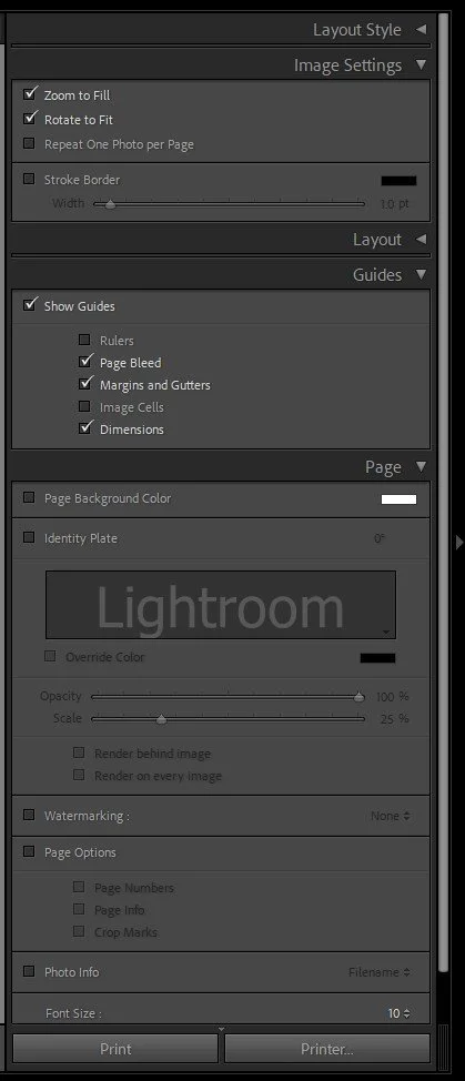
📸 Screenshot : SS2 - Layout Styles, Image Settings and Layout Panels.
Print Job Settings (Right Panel)
This section governs how your image is rendered and delivered to the printer or file.
· Print To: Choose between Printer or JPEG File (for lab prints).
o If you are sending your image to an external lab, you would use the Print To File option
· Resolution: 300ppi is standard for fine prints. If unsure, use this setting.
· Print Sharpening: Choose Low, Standard, or High. Also pick your Media Type (Glossy or Matte).
· Colour Management:
o Profile: Choose your paper/printer ICC profile (often downloadable from paper manufacturers).
o Rendering Intent: See below for more information
· Print Adjustment: Here, you can manually increase or decrease the brightness and/or contrast of the print if it’s not quite to your taste.


📸 Screenshot : SS3a & SS3b – Print Job panel and ICC Profile Dropdown
Perceptual vs. Relative – What Do They Do?
Sometimes, your image file contains colors that your printer can’t reproduce exactly — especially if you’ve been working in a wide color space like ProPhotoRGB or AdobeRGB. These colors are said to be out of gamut (outside the printer’s range).
Lightroom gives you two options for how to handle those colors when converting your image for print: Relative and Perceptual. Each treats out-of-gamut colors differently.
Relative
Keeps all colors that can be printed exactly the same. Colors that are outside the printer’s range are simply clipped to the closest match.
➤ Best for images where color accuracy matters — like portraits, product photos, or clean graphics.
Perceptual
Shifts all the colors slightly (even the ones that are printable) so that everything stays visually balanced. This helps preserve the overall look and feel of the image, especially with saturated colors.
➤ Best for colorful scenes like sunsets, landscapes, or artistic images where preserving tone and harmony is more important than exact color values.
Which Should You Choose?
There’s no one right answer. If you're unsure, use Soft Proofing in Lightroom to toggle between them and choose the one that gives you the most natural-looking result in print.
Page Setup and Printer Settings
These two buttons access the same printer dialog, but with different outcomes:
· Page Setup (bottom left): Opens the print driver settings without printing. Use this to configure page size and paper type.
· Printer (in Print Job panel): Opens the same settings, but clicking OK will immediately send the print to your printer.

📸 Screenshot : SS4 – Print Setup and Printer Settings buttons
Things to Check:
· Paper Size, Orientation and Source: Match this to your printer and paper – You can either set these from the initial Print Setup dialog box or click the properties button and set from the Printer Properties dialog box.
· Borderless vs Bordered: Borderless gives edge-to-edge prints but can crop slightly.
· Paper Type: Always choose the correct type in your printer settings to match your paper. The paper supplier will advise you on their recommended settings for each of their paper products. See Part4 in this series for more information on this.
· Colour: Choosing B&W in this will usually produce a better, more accurate image, especially if your printer has dedicated “Photo Black” ink. However it can sometimes take much longer to print
· Presets – You can save different presets to speed up and consistently select settings. For example, you can have an A3 Portrait on Matte Paper in Colour and an A3 Landscape in B&W on Premium Semi-Gloss.
💥Hot Tip - Setting up presets for each paper size, orientation, paper type and colour type will take a little time initially, but will save you time in the long run and more importantly, allow you to consistently choose the right set of settings

📸 Screenshot : SS4b – Print Setup and Printer Properties
👌Pro Tip: Very often, the paper manufacturer will advise you to disable the printer from doing any colour management. This can be in different locations on different printers. For my Epson Et-8550 you go in to More Options, select the Custom radio button in Colour Correction. Then click the Advanced button and choose No Colour Adjustment
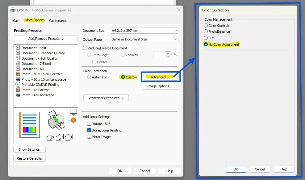
📸 Screenshot : SS4c – No Colour Adjustment
Additional Settings and Details
📏 Guides: Plan with Precision
Found in the Page panel, these are extremely helpful visual aids.
· Margins and Gutters: Show where the printable area ends. Essential to ensure nothing gets cut off.
· Dimensions: Displays the physical size of your printed image—hugely useful when cutting window mounts or planning mat sizes.
· Page Bleed: Shows whether any part of the image may be clipped in borderless printing.
🖊️ Watermarks, Identity Plates, and Photo Info
· Identity Plate: Add your name, a logo, or a title. Great for exhibitions or portfolio pieces.
· Watermarking: Subtle branding or copyright notice.
· Photo Info: Print metadata like filename, capture date, or custom text below the image—ideal for contact sheets or documentary prints.
You can resize and reposition these to suit your print layout. Just be sure they don’t interfere with the photo’s subject.
📸 Screenshot: SS5 – Additional Settings
Saving and Reusing Print Templates
To avoid repeating yourself every time:
· Save your setup as a User Template in the Left Panel. Name it something like "A4 Colour Landscape on Permajet GoldSilk " or "A3 Mono Portrait on Permajet FBMatt" with all of these settings configured appropriately. It takes a bit of time, but is well worth doing.
· Or use Saved Print Collections for a layout tied to specific images. These remember image selection and layout—perfect for reprints.
🛠️ Tip: Create a template for each of your common paper types, sizes and orientations. This speeds up future printing and ensures consistency.
🛠️ Action Step:
If you use Lightroom Classic:
Take 15–20 minutes to fully explore the Print Module. Pick a favourite photo and try printing a test image—A4 or 10x8 is perfect. Test:
· Layout styles (Single vs Custom Package)
· Zoom and Rotate to Fit
· Stroke Borders and Watermarks
· Print Sharpening and ICC Profiles
If you use different software:
Go through your own software’s print settings. Ask:
· Can I control image size and borders?
· Can I add sharpening and manage colour with ICC profiles?
· Can I print multiple images on one page?
· Can I add watermarks, metadata, or create templates?
Experiment, compare, and see how closely you can replicate Lightroom’s flexibility.
🔜 Next Up: “Wrapping It Up” – What to Do Next?
In the final post of our Pixel to Print series, we’ll bring everything together. You’ve edited, proofed, printed, and displayed your images—now what? We’ll explore your next creative steps, and how to keep your print journey going.
Keep printing—and see you next time!
📸 Pixel to Print – Part 8: Mounting and Displaying Your Prints
The thought of printing can be intimidating, but transforming your digital image into a stunning physical print is a rewarding skill. This technical guide covers essential steps like monitor calibration, understanding resolution, and matching aspect ratios to ensure your print looks exactly as you intended.
There’s something truly magical about seeing your image as a finished print—not just on screen, but mounted and proudly displayed. It completes the photographic process and gives your work the space and dignity it deserves.
Whether you’re prepping for a club competition or simply want to hang a favourite shot on your wall, this guide will help you mount and present your prints with confidence and clarity.
“A photograph is not finished until it is printed.”
— David Alan Harvey, Magnum Photographer
🖼️ Mount Board Types: Cheap, Easy, or Pro?
Your mount board is more than just a border—it gives your print structure, protects the edges, and elevates its presentation. There are a few ways to go about it, depending on your budget and workflow:
🪙 The Cheap Way
The Range sells suitable mount board sheets for around £3 each in a wide choice of colours. You can get two 50x40cm mounts from each sheet. The downside? You’ll need to do all the cutting yourself—including the aperture— combining the two can be tricky to get accurate.
⚡ The Easy Way
Pre-cut mounts come ready to go with a pre-cut aperture (usually sized for an A4 print). Just stick your print to the back and you’re done. Quick and tidy, but it does mean cropping your image to fit the standard size—which may not be ideal for every shot.
Members recommend:
· CanvasBay – Bundle includes backing board and bag (note: don’t use the bags for club comps please!)
· Cotswold Mounts – Will cut custom sizes, great for panels of work
🧰 The Pro Way (Recommended!)
Buy pre-cut blank boards (50x40cm) and then cut your own aperture to match your specific image crop. It gives you the best balance—flexibility without the full faff of cutting the outer mount.
See Post 4 in this series for more on aspect ratios and why that matters.
Suppliers for pre-cut blanks:
· PermaJet
💡 Club Tip: We have a Logan Mat Cutter available for club members to use. We’ll be giving a demo of mount cutting in an upcoming printing workshop. See me if you'd like to use it.
✂️ Cutting Tools, Backing Board & Layout Tips
Mount Cutters: Invest in Precision
If you're mounting prints regularly, a mount cutter is well worth it. There are many variations on the market, but common options include:
· Logan Compact Cutter - https://www.logangraphic.com/products/mat-cutters/board-mounted/301-1-compact-classic_p_1.php
· Jakar Mount Cutter - https://jakar.co.uk/product-category/art-craft-materials/mount-cutting-equipment/
You’ll also need:
· A steel ruler (preferably with a lip)
· A cutting mat
· A pencil for marking (lightly!)
💡 Club Tip: We have a Logan Mat Cutter available for club members to use. We’ll be giving a demo of mount cutting in an upcoming printing workshop. See me if you'd like to use it.
Backing Boards: For Structure & Stability
A backing board prevents bending and gives your mounted print a neat, firm finish. Especially with A3 prints, it reduces flex and glare on glossy papers.
Two options:
1. DIY – Use the waste aperture cut-out, flipped and taped to the back. Free, but may feel a bit rough.
2. Pre-cut Backing Boards – Neater, thinner, and slightly smaller than the mount board. Designed to fit perfectly and give a clean edge.
These are available from:
Tape: Hold It All Together
Use archival framers tape—not masking tape—for mounting. Look for:
· Acid-free
· 1.5" or 2" wide
· Available from mount suppliers or on Amazon UK
You might also need:
· Spray adhesive (DaveH’s method)
· Double-sided tape (my preferred method)
Layout Tips
· Size: Stick with 50x40cm mounts for competitions. Avoid 20"x16" (they won’t fit most salon systems).
· Placement: Position your print slightly above centre—a subtle trick that feels more balanced when displayed.
· Print Size: A4 is perfect. Even with an A3 printer, don’t feel you have to fill the page. I often print slightly larger than A4 on A3 paper—it’s wasteful, yes, but looks much better to my eye.
Let the mount frame your work—not compete with it.
🖼️ Framing, Portfolio Folders & Alternative Displays
Framing: For Home Display, Not Competitions
Let’s clear up a common misconception—framed images are not required for club competitions. In fact, they’re usually disallowed, as handling and displaying framed images is awkward and risky. For club work, stick to 50x40cm mounted prints without frames.
That said, framing is one of the most satisfying and professional ways to display your prints at home, and it’s an important part of celebrating your work.
When selecting frames:
· Choose simple wood or metal styles
· Stick to neutral colours that complement—not overpower—your image
· Consider non-reflective glass to reduce glare
· Avoid ornate frames unless they really suit the image and space
Frames are usually chosen to match both the photograph and the room it’s displayed in. A moody black and white portrait may suit a matte black frame in a modern lounge, while a soft landscape may look better in natural oak in a warmer setting.
Where to buy?
· Dunelm
You can pick up decent 8x10" frames for about £5—a perfect starting point for creating your own home gallery.
Alternative Display Options
Not ready for wall hooks? Try these instead:
· Clip Frames – Simple, minimalist, but more fragile and not ideal for comps
· Photo Ledges – IKEA and similar stores sell narrow shelves that make it easy to rotate prints without re-hanging
· Print Boxes – Great for storing your work or themed panels (I keep my LRPS and DPAGB submissions in these). Also handy for posting mounted images safely
Portfolio Folders: A Book for Your Prints
Want to share your prints like a photo book? Try a folio binder or photo album.
These are a stylish, practical way to:
· Showcase a body of work
· Take your prints to show others
· Store your favourites without framing everything
Recommended:
· PermaJet Portfolios
· Fotospeed Portfolios
You can also find traditional photo albums for smaller prints—especially good for family and travel shots.
🛠️ Action Step:
Pick one of your favourite prints, mount or frame it, and hang it up at home—even if it’s just on a pinboard.
Notice how it feels to see your work on display. You might be surprised how proud it makes you feel.
🔜 Next Up: “Printing with Lightroom”
Now that you’re ready to show your work off—how do you get the perfect print out of Lightroom?
In the next post, we’ll look at Lightroom’s print module, layout settings, margins, colour management, and how to export for print. Whether you're using a home printer or sending to a lab, this post will help you prepare images properly for stunning results.
📸 Pixel to Print – Part 7: Soft Proofing and Colour Management
The thought of printing can be intimidating, but transforming your digital image into a stunning physical print is a rewarding skill. This technical guide covers essential steps like monitor calibration, understanding resolution, and matching aspect ratios to ensure your print looks exactly as you intended.
Ever printed a photo only to find it looks nothing like what you saw on screen? Maybe it’s too dark, the blues are off, or the colours feel dull. You're not alone—and the fix lies in understanding the subtle magic of colour management and soft proofing.
"The negative is the equivalent of the composer’s score, and the print the performance."
— Ansel Adams
Source
When we print, we’re performing. But to ensure our print hits the right note, we need to control the tools of that performance—our monitors, our files, and the paper we print on. Let’s dive in.
📸 Why Prints Come Out Too Dark or Too Blue
It’s a classic problem. You spend hours editing, but your print comes back looking darker, muddier, or cooler (blue-tinted) than expected. Why?
Here’s what’s usually going wrong:
Monitor Brightness: Most monitors are far brighter than they should be for editing prints. This means you’re often editing your photo based on a screen that’s glowing much more than paper ever will. As a result, you may unknowingly make the image too dark to compensate. Then, when it’s printed, it comes out much darker than you expected.
Uncalibrated Displays: If your monitor isn’t calibrated, the colours you see aren’t accurate. What looks like a clean white or subtle skin tone on screen might shift completely on paper.
Ignoring the Paper and Printer: Every printer and paper combination interprets colour differently. If you don’t tell your editing software what kind of paper and printer you’ll use, it’s like playing music without knowing the key—it might come out all wrong.
In addition to using the correct ICC profile, you’ll also need to select the appropriate paper type setting in your printer driver. This tells the printer how to handle the paper’s physical characteristics, like whether it’s matte or glossy, how thick it is, and how much ink to lay down. Most paper manufacturers provide recommended settings for each of their papers. For example, PermaJet includes a helpful reference sheet in every box listing which driver settings to use for each paper type: PermaJet Settings Sheet.
🔧 Quick Fix: Start by reducing your monitor brightness to around 80–100 cd/m² when editing for print. It might look dim at first, but your prints will thank you.
📸 Using ICC Profiles and Monitor Calibration
To get consistent, predictable results from screen to paper, you need to manage colour properly. That means doing two key things:
1. Monitor Calibration
We discussed the importance of monitor calibration back in Part 4 – Prepare to Print, but it’s an important part of colour management that it’s worth expanding on here.
When you calibrate your monitor, you're essentially teaching it to display colours and brightness levels accurately and consistently. Most monitors out of the box are tuned for general use—meaning they’re often too bright and overly saturated, which looks great for browsing or gaming, but not for printing.
Why it matters: If your monitor is too bright, then you’ll be artificially compensating for your screen and making the image file darter. Then when you print your image, your prints may come out too dark. If your screen has a colour cast, your prints might lean too warm or too cool. Profiling your monitor aligns its output with standard colour values, helping you make editing decisions with confidence.
🔧 How Monitor Calibration Works
A hardware calibrator is a small device that sits on your screen and measures how your monitor displays a series of colour and brightness patches. It compares this to known standards and builds a custom ICC profile for your monitor—essentially a correction map your computer uses to display colours more accurately.
Once installed, this profile becomes the foundation of a colour-managed workflow. It helps Lightroom, Photoshop, and other editing software show you colours as they truly are, especially in tricky areas like skin tones, highlights, and deep shadows.
🛠 Suggested Calibration Tools
There are two main brands trusted by photographers:
· Datacolor Spyder X Pro or Elite
o Approx. £150–£250
o Fast and beginner-friendly, with automatic room light detection
o Available at WEX Photo Video
· X-Rite / Calibrite Display Pro HL (formerly i1Display Pro)
o Approx. £200–£300
o More advanced features for demanding users
o Available at Park Cameras
Both come with easy-to-follow software that guides you through the process in about 5–10 minutes.
💡 Practical Tips
· Calibrate in a neutral environment: Use a dim, evenly lit room with neutral-coloured walls to avoid colour contamination.
· Avoid glossy screens: They can reflect room light and distort your perception of colour and contrast.
· Target settings:
o White point: D65 (6500K)
o Gamma: 2.2
o Brightness: 80–100 cd/m² for print editing (or up to 120 cd/m² if you review prints in brighter lighting)
🗓️ Recalibrate once a month—monitors shift over time, and staying on top of calibration ensures consistency across print projects.
2. ICC Profiles
Again, we touched on ICC profiles back in Post 4, but they’re important enough to expand in more detail.
An ICC profile is a small data file that tells your editing software how colours will appear when printed on a specific paper with a specific printer. Without it, your photo might suffer from unexpected colour shifts—like greenish skin tones or dull skies.
Luckily, most of the time, you don’t need to create one yourself. Just go to the paper manufacturer’s website—like PermaJet, Hahnemühle, Fotospeed, or Canson—find your printer model, and download the ICC profile for the paper you’re using.
Your editing software uses this profile to soft proof your image and guide more accurate colour decisions.
🔧 Quick Fix: Installing ICC Profiles
Download and install the ICC profile that matches your printer and paper. Think of it like giving your computer the instructions it needs to speak the same language as your printer.
· On Windows: Right-click the .icc or .icm file and choose Install Profile.
· On Mac: Manually place the file in ~/Library/ColorSync/Profiles (user only) or /Library/ColorSync/Profiles (system-wide).
🔧 How ICC Profiles Work
Every printer has its own colour gamut—the range of colours it can reproduce—defined by its hardware and ink set.
Every paper type also has a unique colour response based on its coating, brightness, and texture.
An ICC profile maps your image’s colours into what that specific printer–paper–ink combination can accurately reproduce.
🛠️ How to Use ICC Profiles
Here’s where ICC profiles come into play:
· Soft Proofing: In Lightroom or Photoshop, use the ICC profile to preview how your photo will look in print.
· Exporting: Usually, export in a wide-gamut colour space like Adobe RGB or ProPhoto RGB. Only convert to a printer ICC profile if your print lab requires it.
· Printing: In the Photoshop Print dialog, select the correct ICC profile under “Color Management” to ensure accurate output.
📩 Can’t Find a Profile?
Most high-end paper manufacturers—like Fotospeed, PermaJet, and Hahnemühle—offer a free custom profiling service if they don’t already have an ICC profile for your printer model. You print a test chart (they’ll provide the file), send it to them, and they create a bespoke profile tailored to your exact printer, paper, and ink combination.
This ensures the highest possible accuracy—especially useful if you're using less common printers or third-party or refillable ink systems.
🎯 Important Reminders
ICC profiles are specific. You’ll need:
· A different profile for each paper type, even within the same brand.
· A profile that exactly matches your printer model.
· Profiles that align with your ink set—especially if you’re not using OEM inks.
🎨 Bonus Tip
Think of ICC profiles as the translator that helps your printer and paper “speak the same language.” Without them, you’re leaving colour accuracy up to guesswork.
🔍 Pro Tip
ICC profiles are only as useful if your monitor calibration is correct. If your screen isn’t accurate, soft proofing won’t reflect reality. Use a hardware calibrator like X-Rite i1Display or Datacolor Spyder for best results.
What is Soft Proofing?
Soft proofing is the process of previewing—on screen—what your image will look like in print. Your editing software uses the ICC profile to simulate how the printer and paper will render the photo.
This gives you a chance to see and correct any shifts in colour, contrast, or saturation before you print.
It can be a little humbling. That rich black in the shadows might not print as deep, and some vibrant colours may dull slightly, depending on the paper. But that’s the value of soft proofing—you’re in control and can make informed adjustments.
How to Soft Proof in Lightroom and Photoshop
In Lightroom Classic:
1. Open your photo in the Develop module.
2. Check the Soft Proofing box at the bottom of the screen.
3. In the Profile dropdown, select the ICC profile for your chosen paper and printer.
4. Choose a Rendering Intent—try both Perceptual and Relative to see which looks better.
5. Tick Simulate Paper & Ink for a realistic preview.
6. Create a virtual copy to make print-specific edits without affecting your original.
In Photoshop:
1. Go to View > Proof Setup > Custom…
2. Select your ICC profile in the Device to Simulate dropdown.
3. Choose a Rendering Intent (Perceptual or Relative).
4. Tick Black Point Compensation and Simulate Paper Color.
5. Use View > Proof Colors to toggle the soft proof view on and off while editing.
🔧 Quick Fix: While soft proofing, look for clipped shadows or colour shifts, especially in reds and blues. Make gentle adjustments to keep your print looking natural and true to your vision.
🛠️ Action Step: Using Soft Proofing
Download the ICC profile for the paper you plan to use, enable soft proofing in Lightroom or Photoshop, and experiment with a favourite photo. Make some small adjustments and print a test version—you’ll likely be much closer to what you intended.
🔜 Next Up: Presenting Your Prints
Once you’ve picked the perfect paper and made the perfect print—how should you show it off?
In Pixel to Print #7, we’ll explore how to mount, frame, and display your photos for competitions, exhibitions, and your own wall at home.
Until then, happy printing—and enjoy discovering the creative power of paper.
📸 Pixel to Print – Part 6: Paper Types – The Hidden Power Behind Your Prints
The thought of printing can be intimidating, but transforming your digital image into a stunning physical print is a rewarding skill. This technical guide covers essential steps like monitor calibration, understanding resolution, and matching aspect ratios to ensure your print looks exactly as you intended.
Have you ever looked at one of your favourite photos and thought:
“This looks great on screen… but something’s missing when I print it”?
That missing ingredient might just be your choice of paper.
Choosing the right paper isn’t just a technical decision—it’s a creative one. It influences the mood, emotion, and impact of your image far more than many photographers expect.
“The print is the final statement of the photographer’s intent.”
— David Alan Harvey, Magnum Photographer
📸 Understand Your Photography Style
Before diving into paper types, take a moment to think about your photography style.
· Bold colours, high contrast, dramatic light? → Try Glossy or Baryta.
· Soft, emotive, atmospheric images? → Opt for Matte or Textured Fine Art.
· A bit of everything? → Lustre or Satin finishes are great all-rounders
Understanding how you shoot—what you love to capture and the mood you want to evoke—can guide your paper choices from the start.
🧪 How Paper Affects Your Print
Paper isn't just a passive carrier of your image—it interacts with the ink and your photo’s characteristics.
Tone: Glossy and Baryta papers often deepen blacks and brighten highlights, giving your images a punchy feel. Matte and textured fine art papers mute highlights slightly, which can enhance mood or subtlety.
Contrast: Smooth papers tend to enhance contrast, while textured papers soften transitions between tones.
Texture: This adds a physical quality to your image. Smooth paper feels modern and clean, textured paper feels tactile and traditional. Choose based on the emotion you want your viewer to feel.
Try This: Print the same image on three different paper types and compare them.
A misty morning landscape might feel dreamy on matte but dramatic on gloss. Ask yourself, What are you looking to convey with your image, and allow that to guide your choice in paper.
📦 Manufacturers and Paper Ranges
There are a large number of paper manufacturers to choose from, and within that, each of the manufacturers have a varied choice of Matte papers, of Glossy papers and of Luster paper - so which do you choose for a given image? Well, there isn’t a right or wrong answer to be honest. It’s very much a personal perference.
Start with these brands:
Hahnemühle – Renowned for fine art and cotton-based papers
PermaJet – A UK favourite with a huge range and great value
Fotospeet – Another UK favourite In The Camera Club Community
There are others of course, you can buy cheap paper from amazon as a fraction of the cost of some of the offerings that these manufactuers provide. And if you feel you get good results, then great, I’m pleased for you. But these are well known and generally well renowned for quality, service and choice. I have personal expereince with each of these, and while I have my personal preferences, I would be happy printing on any of these.
Another alternative is using paper designed and branded by your printer manufacturer. These will often yeild good results as they are designed with subtle nuences that are particular to that brand of printer.
Manufacturers usually have a selection if papers of a similar class - For example. Permajet’s range of Lustre type papers is considerable.
Oyster 271
Smooth Pearl 280
Photo Luster 3310
Ultra Pearl 295
So, which do you choose? Well, as with the choice of manufactuers, it is very much personal preference. If you have a keen eye, then you will find that there are very subtle differences between them. These might include slight differences in paper weight, the surface detail, and the base white point.
So really you have to experiment with the papers. Think about going along to a workshop or open day that the manufactuers often run. These can give you the opportunity to learn about the range of papers and bring in a couple of images to do test prints of for you to compare. Manufactuers also often provide a swatch book with small samples of each of their papers. You could use this as a quick reference to remind myself of what each looks like before I buy a new paper type.
By far the best way to try out papers is to buy sample packs. Most manufactuers will do this, and include a couple of A4 sheets from each of their ranges. Permaject for example have test packs for their ranges
Test Pack 1 - Digital Photo
Test Pack 2 - FB Baryta
Test Pack 3 - Fine Art
Test Pack 4 - Double Sided
They also do a Heritage Range Discovery pack.
You can browse their websites for sample packs, or check with your local lab or print supplier.
Order a media swatch book to physically handle each paper type and see how it reflects light.
For general photo printing, try the PermaJet Test Pack 1 – Digital Photo is a brilliant starting point. It includes a wide range: Glossy, Lustre, Matte, and even a Metallic paper for you to experiment with.
When using test packs, I select a couple of images that I feel might work well on a given paper type, and print them 2 per A4 page on each of the papers - I can then compare and contrast the paper I prefer and go on to purchase - Don’t forget of course to use the correct ICC Profile and printer driver settings.
📄 Glossy, Lustre/Satin, Matte, Baryta, and Fine Art – What’s the Difference?
Glossy
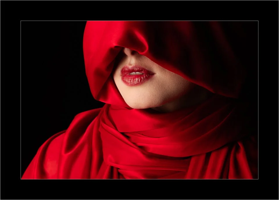
High-shine and punchy, glossy papers are fantastic for bold, colourful images. Think saturated landscapes or vibrant street photography. They produce deep blacks and rich colours but are prone to fingerprints and glare under glass. People who are new to printing often go for this class of paper, remembering back when Glossy meant premium, but it can be very marmite. I use glossy paper with caution. Very few of my images work well on glossy paper, and those that might, I would tend to go for a Baryta for a rich, quality feel.
This one however I feel does. It’s a portrait with bold colours, the shiny material and lips lend themselves to a more glossy paper. The paper I actually tend to use for this is Permajet FB Royal Gloss 310
Lustre/Satin
A perfect middle ground. Lustre or satin papers have a slight sheen without the full gloss effect. They hold contrast and colour well while being more forgiving of reflections. Great for portraits, events, and general-purpose printing. This type of paper should be your go to paper when first starting out printing. It’s not always going to give you the very best results, but untill you can develop your expereince and build up your informed preferences it’s very much a safe choice. I tend to print my nature based work on this kind of paper. For example, this photo of dolphins, I choose the Permajet Smooth Pearl 280 This image has strong colors, but it’s not punchy and bright, it’s gentle and muted. This particular one may work on a matte paper, but I perfer the lustre.

Matte
Velvety and soft, matte papers give your images a more subdued, artistic feel. Ideal for subtle tones, fine art images, and black & white photos. They reduce glare completely but can flatten contrast slightly. I often choose a matte paper for my high key portraits that are soft and gentle like this one. A textured fine art paper is a tempting choice, but not in my opinion a good one because the smooth skin tones would be impacted by the texture of a strong paper, so I usually choose to print this on FB Matt 285

Baryta (pronounced "bah-ree-ta")
A nod to traditional darkroom prints, Baryta papers have a smooth surface with a slight sheen and a deep, rich tonal range. These papers often bring a rich, high-quality feel to prints but tend to be more expensive than standard photo papers—well worth considering for your best work or exhibition prints.
This image has deep blacks and high dmax. It could work on a glossy paper, but a luxurious baryta paper give it a realy rich, quality feel so I choose to print this on FB Gold Silk 315

Fine Art (Rag & Textured Papers)
These are usually matte papers made from cotton or alpha-cellulose, often with a rich texture. Think Hahnemühle Photo Rag or Canson Aquarelle. They lend a painterly quality to images and are perfect for moody, contemplative, or vintage-style photographs.
This image, although has soft smooth skin, also has a texture overlay and grain so it works well on fine art paper. I usually choose to print this on Portrait White 285 which has a gentle texture

Speciality Papers - There are a number of perculiar papers out there. Very heavy textured canvas, or a leathery sheen perhaps might suit a particular image. They should be treated with extreme caution though. Lets think about Metalic paper for example. These have a colourful sheen to it that can be very marmite. Its either loved or hated. For the right image, I love it. Images of metal objects such as cars can work well - think an old classic american muscle car in Cuba. Also monochrome and images with lots of water can look very nice on this type of paper. An example of an image that I would print on metalic paper is this one. It contains lots of naturally shiny surfaces like the glass in the shard and the water. It is also being a monochrome, it has lots of steely greys which can often sit well on this paper.

🎯 Summary Tips on Choosing the Right Paper for Your Photo
Here are some practical ways to match your image with the perfect paper:
🖼️ Match paper to mood
· Dramatic and high contrast images → Glossy or Baryta
· Soft and emotional images → Matte or Fine Art
· Everyday versatile use → Lustre or Satin
🔍 Use test prints
Print postcard-sized versions on different papers to compare the effect before committing to a large or final print.
🧰 Build your personal ‘arsenal’
If, like me, you shoot a wide range of subjects, I recommend choosing three go-to papers:
· One Glossy for punchy colour
· One Satin/Lustre for general use
· One Matte/Fine Art for subtle tones and classic styles
This gives you a flexible but focused selection to start your printing journey.
🌑 Low key vs. high key images
· Low key images (deep shadows, dramatic light) often look best on Glossy or Baryta papers that preserve shadow detail and depth.
✅ Tip: Avoid printing very low key images on matte paper. Matte finishes can crush blacks and leave your photo looking flat or washed out.
· High key images (light, bright, soft scenes) often suit smooth matte papers that maintain subtle tonal transitions.
⚠️ Specialist papers—use thoughtfully
Metallic papers can wow a viewer—or horrify them. They’re best used sparingly and with care. They work well for:
· Chrome or metallic subjects like cars
· Reflective scenes like water
· High-contrast monochrome images
They can create dramatic results but may not always be well received in competitions or exhibitions. Use them for the right image—and expect strong reactions.
🛠️ Action Step: Explore Two Paper Brands
Your challenge this week is to explore the paper offerings from two leading brands:
1. Hahnemühle – Industry leader in fine art printing
2. PermaJet – UK-based, with accessible and diverse paper options
Head to their websites and browse the Glossy, Lustre, Matte, Baryta, and Fine Art categories.
Make a note of any papers that catch your eye—think about how they'd work with your style of photography.
Look into ordering a media swatch to handle papers and see finishes first – I’d suggest doing this if you own a printer or not!
If you have your own printer, try getting a test pack like PermaJet’s Test Pack 1 – Digital Photo to trial multiple finishes, including metallic
🔜 Next Up: Presenting Your Prints
Once you’ve picked the perfect paper and made the perfect print—how should you make sure it looks right when you print it off?
In Pixel to Print #7, we’ll explore how to handle colour management, talk about ICC Profiles and use Soft Proofing
📸 Pixel to Print – Part 5: Home Printing vs. Lab Printing
The thought of printing can be intimidating, but transforming your digital image into a stunning physical print is a rewarding skill. This technical guide covers essential steps like monitor calibration, understanding resolution, and matching aspect ratios to ensure your print looks exactly as you intended.
There’s nothing quite like holding your own photograph in your hands — the weight of the paper, the texture, the way light bounces off the surface. It’s the moment your image becomes real.
In this post, we’re exploring one of the most exciting crossroads for any photographer: should you print at home, or send your images to a professional lab?
“A photograph doesn't feel real until it is a tangible physical object I can hold in my hand.”
— Stephen Shore, The Guardian
🖨️ Home Printing: What’s Involved?
Home printing gives you total creative control — ideal for hands-on photographers who love to tinker and refine. Here’s what you’ll need to get started:
First of all, if you have an inkjet printer at home already, then you are good to start printing photographs. Get hold of some basic photo paper and give it a go. If you want a few sheets to get you going then the club has some that you can try out in the first place, just ask and we can let you have some.
Size - One of the first decisions to make is what print sizes you intend to produce:
A4 or 8”x10” - Standard for general home use. Great for casual prints and small wall displays. Fine for competition images.
A3 or 13" x 19" (A3+): Ideal for enthusiasts or semi-pros wanting gallery-quality prints. This is the sweet spot for many serious hobbyists.
Large Format (up to 17", 24", or beyond): Some home-based pros invest in these for exhibition-quality prints, though they require significant space and cost more.
Although most club members that print, use an A3 printer, it is absolutley not a requirement even for competitions. Infact, printing full sized A3 images not only can look worse on a standard 40x50cm mount, it also means that you need a bigger file. The RPS currently even recomend printing A4 against a 40x50 mount. Personally, I usually print slightly larger than A4 - From last weeks post, you’ll recall that an A3 sheet is 297mm wide and 420mm tall - I usually aim to print arround 230mm wide and 340mm tall (13.5”x9”)- A little wastefull I know, but I prefer that kind of size as it also gives me scope to leave whitespace around the image which can look striking when used with a stroke line.
And… Spoiler Alert… Next season, we are introducing a new class open to all, for A4 unmounted prints!
Printer Manufacturers - Each brand has its strengths—Epson leads in longevity and archival quality, Canon excels in vibrant color output, and HP can be a good choice for occasional photographers on a budget. While you are free to do your own research and go with whatever make and model suits your needs, if you are looking at a printer to with a prime perpose of printing photographs, then you would do well to stick to the big 2.
Epson: Widely regarded for its pigment-based printers (e.g., SureColor P700, P900). Offers excellent color fidelity and deep blacks, especially good for fine art and monochrome.
Canon: Known for high-quality dye and pigment printers (e.g., PIXMA PRO-200, PROGRAF PRO-300). Canon printers typically deliver vivid colors and smooth gradients.
HP: Less prominent in the high-end photo printing space today but still offers competent all-in-ones for general-purpose photo printing.
Ink – There are two main types of ink used in photo printers:
Dye-Based Inks: These produce vibrant, glossy prints with excellent color gamut. However, they tend to fade more quickly over time unless printed on archival-grade paper and stored properly. Great for casual or decorative use.
Pigment-Based Inks: These offer superior longevity, water-resistance, and fade resistance, making them ideal for archival and professional-quality prints. Modern pigment printers also produce excellent color depth and black density, especially for monochrome work.
Ink Cartridge Systems vs. Refillable Tanks
Individual Ink Cartridges: Most photo printers use multiple individual cartridges (6, 8, or even 10 inks), each dedicated to a specific color. This allows for precise color reproduction and better efficiency. However, ink can be expensive.
Refillable Ink Tank Systems (e.g., Epson EcoTank): These printers allow bulk refills from bottles, offering a much lower cost per print. While early models compromised on photo quality, newer versions are capable of producing excellent photographic output, especially for enthusiasts doing high-volume printing.
Tip: Always check whether the printer uses separate black inks for photo black and matte black media. High-end printers often switch between the two depending on your paper choice.
Ink Sets - One of the defining features of a photo printer is the number of inks it uses. Unlike basic office printers that rely on just four colors (cyan, magenta, yellow, and black — CMYK), photo printers often use six or more inks to achieve smoother tonal transitions, wider color gamut, and more accurate image reproduction. But what does this mean in practice, and how many inks do you need?
Basic 4-Color (CMYK) Systems - These are typically found in entry-level all-in-one or office printers. They’re suitable for everyday printing and the occasional photo, but they fall short when it comes to reproducing fine details, subtle color transitions, or rich blacks.
Best for: Casual use, document printing, occasional 4x6” photo prints.
6-Color Printers – Today’s mid-range photo printers commonly use six inks to improve image quality beyond what basic 4-color systems can deliver. The exact configuration can vary depending on whether the printer uses dye-based or pigment-based inks or a mixture of both. As well as the standard 4 colours (CMYK) these printers often use an additional, Photo Black (which is usually pigment) and a Gray. This enhances tonal range, improves shadow detail, and provides better neutral and black & white performance — especially on matte and fine art papers.
Best for: Enthusiasts who print frequently and care about quality, but don’t need gallery-grade output.
8 to 10-Color Printers - Professional photo printers often use 8, 9, or even 10 individual inks, including specialized colors. This range of inks allows for stunning depth, color fidelity, and tonal smoothness that serious photographers demand.
Best for: Fine art photographers, professional portrait and landscape shooters, monochrome specialists, and anyone preparing prints for sale, exhibition, or archival storage.
Other Important Factors to Consider:
Print Quality (Resolution & Dot Size): Look for printers with high DPI (dots per inch), but also pay attention to real-world reviews of sharpness, color accuracy, and tonal gradation.
Monochrome Performance: Not all color printers handle black and white equally well. Look for models with dedicated gray inks for smoother gradation and less color cast.
Media Handling: Ensure the printer can handle different paper types (glossy, matte, fine art, canvas). Some offer straight-through paper paths for thick media.
Color Management Support: ICC profile support and compatibility with color-managed workflows are essential for accurate soft-proofing and consistent output.
Footprint and Usability: Some photo printers are large and heavy. Consider your workspace, ease of maintenance, screen interface, and wireless connectivity.
Paper – From glossy to fine art matte, paper choice changes the whole feel of a print.
Calibration Tools – Use a monitor calibration tool (like the SpyderX) to ensure your screen matches your prints.
Beginner Tip: Start by printing smaller sizes like 6x4” to test colors and papers without using up lots of resources.
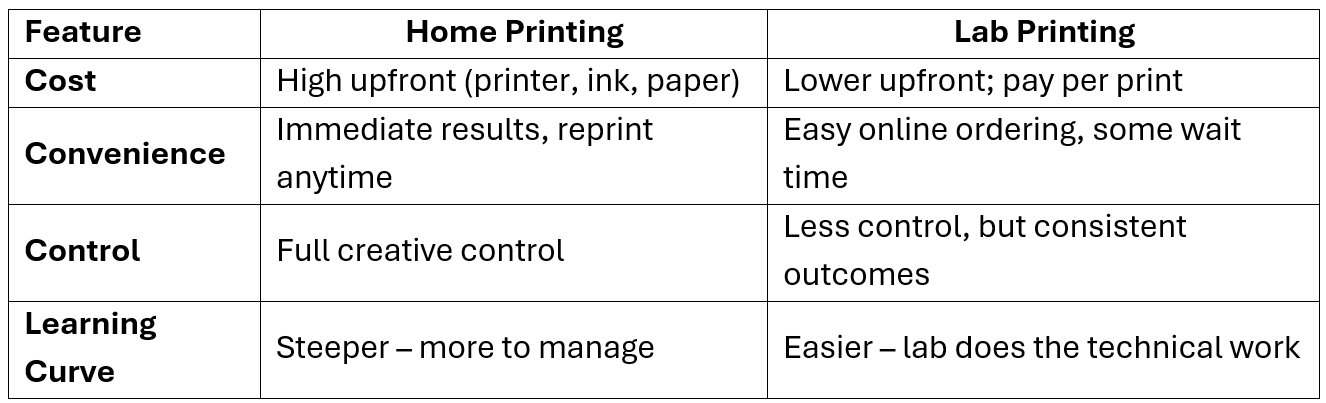
✅ Home Printing – Pros & Cons
Pros:
Total Creative Control – Refine images exactly how you like.
Instant Results – No waiting — print anytime.
Experiment Freely – Try different papers and edits without extra cost per attempt.
Hands-On Learning – Develop a deep understanding of color and print workflows.
Cons:
High Initial Cost – Printers, ink, and paper can be expensive upfront.
Maintenance Required – Printers can clog or require upkeep.
Steeper Learning Curve – More technical skill is needed.
Requires Space – Quality printers take up room.
🏢 Lab Printing: Easy, Professional, and Consistent
If you’d rather skip the technical learning curve, printing via a lab is a brilliant option. You get reliable quality, wide paper choices, and great customer support.
Top UK Labs to Check Out:
Online Labs:
DS Colour Labs – Fast, affordable, great for everyday prints. - https://www.dscolourlabs.co.uk/
Loxley Colour – Pro-grade photographic and mounted prints. - https://www.loxleycolour.com/
Cewe - High-quality photo prints, professional paper options for both casual and serious photographers- https://www.cewe.co.uk/
Sim Lab – Budget-friendly with solid quality. - https://www.simlab.co.uk/
With most labs, you simply upload your photo, choose paper and size, and wait for the postman to deliver your masterpiece.
Supermarkets also tend to offer photo printing now. Asda in Gloucester has an in house service. Tesco Photo has an online service.
Specialist camera shops including London Camera Exchange and Clifton Cameras also offer in printing services. If there is demand, we the club can potentially negotiate favorable deals with them to enable members to print.
Pro Tip: Always check file format, color profile, and resolution guidelines before uploading!
✅ Lab Printing – Pros & Cons
Pros:
Professional Quality – Industry-level printers and papers.
Convenient – No setup, maintenance, or calibration needed.
Wider Range – Access unique paper types and finishes.
Reliable Results – Especially with experienced labs.
Cons:
Less Control – Limited ability to make last-minute tweaks.
Delivery Time – You may need to wait a few days.
Per-Print Cost – More economical for occasional printing, but adds up over time.
File Prep Required – Ensure you’ve got color profiles and resolution right.
🧾 Matching Paper Types to Image Styles
Choosing the right paper adds personality to your photo. We will be talking much more about papers in an upcoming post, but here’s a quick guide:
Glossy – Shiny, bold, ideal for colorful landscapes or street scenes.
Luster/Satin – Subtle texture, excellent for portraits and general use.
Matte – Non-reflective and soft, ideal for black & white or moody edits.
Fine Art Textured – Painterly feel, great for artistic or abstract images.
Try This: Order a sample pack from your lab to see and feel paper types firsthand.
🤔 Home vs. Lab: Which One is Right for You?
👯 No Printer? Buddy Up!
We’re continuing our Print Buddy system in the club! Don’t have a printer yet? Pair up with a fellow member who does. You’ll get hands-on experience, learn the ropes, and print your images together.
Ask a committee member if you'd like to be matched up!
Bottom Line:
Love to experiment and learn? Go with home printing.
Prefer simplicity and polish? Lab printing might be your best bet.
🛠️ Action Step:
Do a little research to explore your print options. Look up 2–3 labs (local or online) and compare:
Print sizes and formats
Paper types
Prices for standard sizes (e.g. 6x4", 8x10", A4, A3)
Turnaround time and shipping
Optional: Order a small test print to assess paper and print quality firsthand.
🔜 Coming Next: “The One You’ve All Been Waiting For – Paper Types”“Editing for Print: Getting Your Images Ready”
We’ll take a deep dive into the world of paper — exploring how different textures, finishes, and weights can completely transform the mood and impact of your photographs. If you've ever wondered whether your image would sing on a satin, matte, or fine art surface, this is the post you won't want to miss.
Stay tuned for one of the most important steps in the Pixel to Print journey
📸 Pixel to Print – Part 4: Preparing Your Image for Print
The thought of printing can be intimidating, but transforming your digital image into a stunning physical print is a rewarding skill. This technical guide covers essential steps like monitor calibration, understanding resolution, and matching aspect ratios to ensure your print looks exactly as you intended.
There’s something magical about holding your own photograph in your hands—a moment you captured, now living and breathing on paper. Yet many great images remain trapped in our screens simply because printing feels intimidating. But with a few simple steps, anyone can confidently prepare their images for print.
“A picture is worth a thousand words; A fine art print so much more.” – Steve Denby
Whether you’re aiming to exhibit your work, enter a camera club competition, or just decorate your home, preparing your photo for print is a rewarding skill that connects you more deeply to your craft.
By now, you understand why printing your photographs matters. You’ve chosen the image you want to print and edited it to perfection. Now it’s time to move from pixels to paper—to prepare your photo for print in a way that does justice to your creative vision. This post will guide you through each step of the process, from resizing and sharpening to soft proofing and exporting, so your final print looks just as stunning as it does on screen.
Now, strap yourself in, I make no apologies but this is going to get a bit technical, but it’s information that you should try to understand:
Ensure Your Monitor is Correctly Calibrated.
We’ll cover this topic in more detail in a later post, but for now, just be aware that all digital monitors and displays differ greatly in how they present images, and you can tweak your own display to suit your personal preference. Most monitors, even straight out of the box, are tuned for general use—meaning they’re often too bright and overly saturated. This may look great for browsing or gaming, but it's not ideal for evaluating images for print.
Before you can trust what you see on screen, you need to ensure your monitor is displaying colors accurately. This is where monitor calibration and profiling come in. Calibration adjusts your display to a consistent standard (like white point, brightness, and gamma), while profiling creates a color profile that allows color-managed software to interpret your display’s color behavior correctly.
Is this step vital? Not strictly. You can certainly work around it by printing a test page, assessing the result, and adjusting accordingly. If you print regularly, you’ll soon get a feel for the tweaks you need to make. But is calibration recommended? Absolutely. Your prints will never exactly match the screen (due to differences in color gamuts and media), but calibration gets you much closer and makes editing and soft proofing more reliable. It turns your monitor into a more trustworthy preview of your printed output.
Note: What calibration won’t do is make an image look exactly the same across different devices. There are many outside factors—ambient light, screen type, display age, and even viewing angle. Even two calibrated displays can differ under varying conditions. This is one of the limitations of digital image viewing. Once your image leaves your controlled environment, it's subject to variables beyond your influence. This is one reason why printing your work remains the most consistent way to present it as intended.
Getting The Right Resolution and Size
For a sharp print, aim for 300 pixels per inch (ppi) at the desired print size - This is a common, known definition and is a given - for printing… 300PPI.
Example: Want an 8x10 print? Multiply 8 by 300 = 2400 pixels wide, and 10 by 300 = 3000 pixels tall.
A file sized for our club’s digital competitions—typically around 1920x1200 pixels—is great for screens but not suitable for printing at A4 or 8x10 size. At 300ppi, that image would only print clearly up to about 6.4" x 4" (1920 ÷ 300 = 6.4 inches, 1200 ÷ 300 = 4 inches) before quality begins to degrade.
Most modern cameras shoot at high enough resolution (a 24MP camera produces images around 6000x4000 pixels), which is plenty for printing larger sizes—but cropping heavily can reduce print quality, so plan your composition with printing in mind when possible.
What is resolution?
Think of a photo as a mosaic made of tiny dots called pixels. The more dots you have packed into every inch, the sharper your photo looks when printed. This is called PPI – Pixels Per Inch.
For high-quality prints, aim for 300 PPI.
That just means you want 300 little dots per inch of printed photo.
🛠️ Tip: Always keep your image in 300DPI - you can always create a lower quality (72DPI) copy for sharing online later, but once you’ve reduced it, you can’t go back.
📸 What size are my camera photos?
Most modern cameras give you plenty of pixels.
For example, a 24-megapixel camera creates images that are about 6000×4000 pixels — good enough for poster-size prints!
⚠️ Watch out for cropping:
If you cut away a lot of your photo (to zoom in on something), you're throwing away pixels — which might make your print look fuzzy.
🧮 How big does my photo need to be for printing?
Just do a little multiplication:
Want to print 8x10 inches?
Multiply:
8 inches × 300 = 2400 pixels wide
10 inches × 300 = 3000 pixels tall
So your file should be at least 2400×3000 pixels for a sharp print.
💻 What about printing from those files I create for competitions?
Photos you prepare for digital use—like our club competitions—are usually resized to something like 1920×1200 pixels. This size looks great on screens but isn’t big enough for high-quality printing, especially at sizes like A4 or A3.
Here’s why:
A 1920×1200 pixel image printed at 300 PPI (the quality needed for sharp prints)
= only 6.4 inches x 4 inches
(1920 ÷ 300 = 6.4" wide, 1200 ÷ 300 = 4" tall)
That’s much smaller than A4 (8.3" x 11.7") or A3 (11.7" x 16.5").
If you try to print that screen-sized image larger, it’ll start to look blurry or pixelated.
🗂️ What should you do?
To keep your options open:
Always keep your original, full-size edited photo (that’s what I do).
Or create a second version just for printing—save it at a size suitable for 300 PPI at your desired print dimensions.
That way, you're ready for both digital display and print, without needing to re-edit your image later.
Resolution vs. Print Size at 300 PPI

Match Your Aspect Ratio to Your Print Size
If you've ever printed a photo and been surprised by a missing part of the image—or noticed unwanted white borders—you've run into a problem with aspect ratio. But don't worry! It's easy to understand, and knowing a bit about it will help you take full control of how your photos look when printed or framed.
❓ What is Aspect Ratio?
Aspect ratio is simply the shape of your photo. It describes the relationship between how wide and how tall the image is.
It’s usually written as two numbers, like 3:2 or 4:5.
It’s not about inches or pixels—it’s about proportions. For example:
3:2 means the image is 1.5 times wider than it is tall. This is the native shape of most DSLR and mirrorless camera photos.
4:5 is a little more square - This is common for printing paper – for example 8x10 prints. It’s also the aspect ratio for camera club mounts.
A4 and A3 paper has an aspect ratio of about 1.41:1 – This is standard UK sized paper and is taller and narrower than both “standard” printing paper and camera photos. A4 is 210mm × 297mm and A3 is 297mm x 420mm
9:16 is a common size for TVs – commonly called “wide screen” or “HD Format” - 1920px x 1080px is a common size. (You may have seen the term 1080p – this is where that comes from)
10:16 is a slightly less common size but many people prefer it as it is slightly taller - infact this is what we use on our projector – 1920px x 1200px
🧠 Why Does This Matter?
Because the shape of your photo needs to match the shape of your paper or frame.
If it doesn’t, you’ll either:
Crop off parts of the photo (maybe the best parts!), or
Get white borders when the image doesn’t fill the page.
Think of it like buying clothes: if the size doesn't match, you either squeeze it in, stretch it, or leave space. None of those give a perfect fit.
It’s also really important if you buy pre-cut mounts (mats) for framing.
These mounts are made with a standard aperture (cutout.) If your photo doesn’t match, the mount will crop the image —and you may lose important details like a person’s head or the edge of a landscape.
You should be the one deciding what gets shown—not the paper or mount.

How to Make It Work
Here’s how to stay in control and get the print you want:
✅ Use the Crop Tool Intentionally
When editing your photo, choose a crop that matches your final print size.
Most editing programs (like Lightroom and Photoshop) let you:
Set custom aspect ratios, like 210:297 for A4 or 297:420 for A3
Preview how your image will look printed
🖨️ Crop to Match Paper If Printing at Home
If you want edge-to-edge prints (no borders), crop your image to match your paper size before printing. This avoids surprises and wasted ink/paper.
🖼️ If Framing with a Mount, Plan Ahead
If you’re using a pre-cut mount:
Check its opening size and aspect ratio
📏 Bottom Line
Matching your image’s aspect ratio to your chosen paper or mount size ensures that your photo prints exactly how you intended it to look.
It prevents:
Unwanted cropping
Ugly white borders
Losing control over your final image
Just a little planning during editing can make all the difference—so your photo looks polished, professional, and exactly how you imagined it.
Select the Best Paper for Your Image
We’ll talk more about paper choices in a following post, but just for now, accept that we’ll decide on a given paper to use then we can obtain the correct ICC Profile and apply the right amount of sharpening.
Top Tip: Think about having a small number of preferred papers that you use... Consider a glossy paper, a satin paper and a matte paper. You can then become familiar with those and set yourself up with ICC Profiles for your printer.
Glossy/Satin: Great for high-contrast, colourful images like landscapes or portraits.
Matte/Fine Art Rag: Ideal for black & white, subtle tones, or painterly feels.
🧪 Tip: Try sample packs from paper manufacturers to discover what suits your style.
Choose the Right ICC Profile
Each paper has its own "personality." Glossy papers punch, matte papers whisper. Profiles help your image speak clearly.
Every printer/paper combination handles colour and contrast differently. For example, a Canon printer using glossy paper will render colours more vibrantly than the same printer using a matte fine art paper. That’s because glossy surfaces reflect more light, while matte surfaces absorb it, affecting brightness, contrast, and saturation.
ICC profiles translate your image colours to what a printer/paper combination can reproduce. The profile ensures the colours in the digital file match what comes out of your printer. It does this by accounting for the unique characteristics of your printer, your chosen paper, and your ink set.
Notice, I intentionally say, the colours in the digital files match the print... I specifically do not say “The ICC profile ensures that the colours you see on screen match what comes out of your printer” The reason for this is that if your display is not effectively calibrated, then your computer may not show the correct information so will differ from the print.
Where to Find ICC Profiles
You don’t have to go digging through tech forums. Here’s where to look:
Paper Manufacturer’s Website – If you're using specialty paper (like Hahnemühle, Ilford, or Canson), go to the company’s website. Most have a "Downloads" or "ICC Profiles" section. You simply choose your printer model and the paper you're using.
Printer Manufacturer's Website – Brands like Epson, Canon, and HP often include ICC profiles for their own papers in the printer software. You can also find updates or extra profiles on their support pages.
Photo Labs and Print Services – If you're sending your image to a print lab, ask them if they provide an ICC profile. Many do—and using it lets you preview how your photo will look before it’s printed.
How to Install an ICC Profile (No Tech Skills Needed!)
Once you've downloaded the profile (it ends in .icc or .icm), here’s how to install it:
On Windows: Right-click the file.
Choose "Install Profile." That’s it!
On Mac: Copy the file.
Open Finder, then click Go > Go to Folder... and type:
/Library/ColorSync/Profiles/
(You can also use ~/Library/ColorSync/Profiles/ for user-only access.)
Paste the file in.
Once installed, your photo editing or printing software (like Photoshop or Lightroom) will be able to see the profile when you're ready to print or soft proof.
See Before You Print - Use Soft Proofing
Before you hit “print” on that perfect shot, there’s one important step that can save you frustration, paper, and ink: soft proofing.
Soft proofing is like a dress rehearsal for your photo. It shows you on your screen what your image will probably look like once it’s printed—colors, contrast, and all. Why? Because what you see on your bright, backlit screen often looks different when printed on matte paper with ink. Soft proofing helps you spot these differences ahead of time, so there are no nasty surprises when your print comes out dull, too dark, or slightly off-color.
All you need is a photo editing program like Adobe Lightroom or Photoshop and the “ICC profile” for your printer and paper combo.
You can enable soft proofing in your editing software, load the correct ICC profile for your printer/paper, and preview the image in that color space. Tweak brightness, contrast, and saturation within the soft proof to match your vision. Don’t forget to toggle on the gamut warning to catch colors that won’t print accurately.
👀 Tip: Watch for colour shifts or loss of shadow detail. Tweak contrast or saturation if needed.
👀 ProTip: Soft proofing is most effective when your monitor is properly calibrated and you’re using the correct ICC profile for your print setup.
Whether you're printing at home or sending your photo to a lab, soft proofing bridges the gap between what you see and what you get.
Apply Final Sharpening
Even the sharpest digital images can appear a little softer when printed. This is normal—paper doesn’t display detail the same way a backlit screen does. To compensate, apply output sharpening specifically tailored for your final print size and medium.
What is Output Sharpening?
Output sharpening is the final sharpening step you apply after resizing your image to its print dimensions and resolution (typically 300ppi). Unlike earlier sharpening (which might correct lens softness or improve clarity for screen viewing), this step is designed to enhance edge definition in the printed version.
In Lightroom:
When using the Print module or the Export dialog, choose a sharpening preset under Output Sharpening. Options include:
Standard: A good default for most prints
Low: For very subtle sharpening (e.g., fine art prints)
High: For images that need extra crispness (e.g., detailed landscapes on glossy paper)
Select your Media Type (Glossy or Matte) to tailor the sharpening to how ink spreads on your chosen paper.
In Photoshop:
Use Unsharp Mask or Smart Sharpen. A typical starting point for Unsharp Mask might be:
Amount: 80–120%
Radius: 1.0–1.5 pixels
Threshold: 2–5 levels (higher threshold avoids sharpening noise or fine grain)
Or use Smart Sharpen for more control, especially with high-resolution images or if you're printing on textured paper.
🛠 Extra Tip: If you're resizing in Photoshop, sharpen after you scale your image to its final print size. Resizing first ensures sharpening is applied at the pixel level your printer will use, making it more accurate.
📏 Sharpening and Paper Type:
Glossy and Satin papers hold sharpness well—consider a higher sharpening amount.
Matte and Fine Art papers can absorb ink and soften details—sharpen moderately but avoid overdoing it, as it can cause halos.
🧪 Test Prints Matter: What looks perfect on screen may look different on paper. Run a small test print on your selected paper type if you're unsure—it’s worth the cost to dial in your settings.
🎯 Tip: Always sharpen as your final step after resizing.
Export in the Right File Format
If you are going to send your photo away for printing, then you’ll have to export the image to a file. Check with the print lab which is the prefered method.
JPEG: Best for most lab prints—small size, good quality. Use maximum quality setting.
TIFF: Use when printing at home or sending to a pro lab that requests it. It’s uncompressed and ideal for retaining detail.
💾 Tip: Use sRGB colour space unless your lab recommends AdobeRGB or another profile.
Always send the biggest file possible - refer to the table above for minimum sizes - these are mimimum sizes, you can send bigger, and always send 300DPI
🛠️ Action Step:
Take the image you selected from the previous post and:
Crop it to your intended print size and aspect ratio.
Resize it to 300ppi.
Apply output sharpening.
Soft proof with the correct ICC profile.
Export it as a JPEG (max quality) for lab printing, or TIFF if you're printing at home.
👀 Next Up: Home Printing vs. Lab Printing
In the next post, we’ll dive into printing at home versus using a professional lab. What’s more cost-effective? Which gives you better control? And when should you choose one over the other? Whether you’re considering buying a printer or just want to get the most out of your local print lab, we’ve got you covered.
Until then—get those pixels ready for paper!
📸 Pixel to Print – Post #3: What Makes an Image Worth Printing?
Not every photo is destined for print, but some images simply feel different—they linger in your mind, begging to be brought to life on paper. This post explores the qualities that make an image truly "print-worthy," focusing on storytelling, emotional impact, composition, and technical considerations.
This is the third post in our Pixel to Print series, this week we are going to take a look at what makes an image worth printing.
Have you ever taken a photo that just feels different? Maybe it lingers in your mind, or you find yourself going back to it again and again. That’s often the kind of image begging to be printed—not because it’s technically perfect, but because it means something.
As fine art printer and photographer John Granata says:
“A photograph isn’t finished until it’s printed.”
Source: The Print Space – Interview with John Granata
Printing gives your image permanence, turning pixels into something tactile and lasting. But how do you know which of your photographs are truly worth printing?
Often at camera clubs or exhibitions, you’ll hear a judge say something like “This works much better as a print” or “Don’t look at the digital version—the print is much better.” There could be several reasons for this: the tonal range, the presentation, the tactile impact, or simply the mood enhanced by paper and scale. But remember—these comments are opinions, not universal truths. There’s no hidden checklist being satisfied. What works for one viewer may not work for another, and that’s what makes the print medium so personal and powerful.
🧭 There's No Magic Formula
Let’s get this out of the way: there’s no secret rule or blueprint that makes a photo “print-worthy.” Some of your most meaningful prints may never win a competition—and that’s okay. Printing is as much about personal connection as it is about photographic merit.
In short, have faith in yourself. If you like the image, then print it!
You can stop reading here, the question in the post title has been answered.
That would make for a very short blog post so lets carry on and explore some of the things you might want to consider when choosing what to print. There are some qualities that make certain images stand out as strong candidates for print. These aren’t checkboxes as much as they are guideposts to help you reflect more deeply on your work.

📖 1. Storytelling: What Is This Photo Really Saying?
A print has to stand on its own. Unlike social media or slideshows, there’s no caption or commentary to explain what’s going on. Strong storytelling—whether overt or subtle—gives the viewer something to engage with.
Ask yourself:
· What’s the moment here?
· Is there a beginning, middle, or end—even if it’s implied?
· Does it make the viewer ask questions or feel connected to the subject?
🖼 Example: A photo of a cyclist pausing at sunrise might speak to themes of solitude, adventure, or calm before the race—even if it’s just a split-second scene.
💓 2. Emotional Impact: How Does It Make You (or Others) Feel?
Some images carry weight because of what they mean to you. Others hit home because they stir something universal. These are the ones that stop us in our tracks, regardless of whether the exposure was perfect.
Ask yourself:
· Do I feel something every time I see this image?
· Would this resonate with others?
· Is it tied to a memory, a milestone, or a powerful mood?
🖼 Example: A slightly grainy photo of your grandparents dancing at their anniversary party might not be flawless—but the warmth and meaning make it a keeper.
🎯 3. Composition: Does It Hold Together Visually?
A well-composed image makes an impression even from across the room. Print amplifies both the strengths and flaws in composition, so clarity and intent matter.
Ask yourself:
· Is the subject clear and compelling?
· Are the lines, shapes, and framing helping the image work?
· Could I imagine this hanging on a wall and still enjoying it after a month?
🖼 Example: A high-contrast silhouette of birds in flight, perfectly spaced in the frame, could make a bold and beautiful large-format print—even if the story is simple.
🔧 4. Technical Considerations: Will It Stand Up to Printing?
Let’s not forget the practical side. A photo that looks great as a small image on screen might fall apart on paper if it’s too noisy, out of focus, or lacking in resolution. That doesn’t mean it needs to be “perfect”—but it should be printable.
While emotional impact is key, printing magnifies everything—from beautiful tonal transitions to small flaws—so it’s worth giving your image a careful once-over.
Check for:
· Sharpness and clean detail – Is your subject crisp where it should be (or intentionally soft)? Or does softness distract?
· Exposure and contrast – Do the highlights and shadows retain detail? Is there enough dynamic range for the print to “breathe”?
· No obvious editing flaws – Watch for over-sharpening halos, crushed blacks, blown highlights, or strange colour casts that may not show on a backlit screen but will on paper.
· Is the resolution high enough for the size I want to print?
We’ll cover this in more detail in a later post, but for now just be aware that printing a zoomed-in view from a small-sensor camera on an A3+ sheet of paper may simply not have sufficient quality to look great.
You don’t need perfection—but refining your image before printing will help it shine at its best. Think of this as polishing the frame around your story and emotion.
🛠️ Action Step: Reflect on Your Shortlist
Pull up the images you selected in the previous task—those that stood out to you in some way. For each one, consider the four qualities above:
1. Storytelling – What’s happening here?
2. Emotional Impact – How does it make you feel?
3. Composition – Does the framing guide the eye?
4. Technical Considerations – Will it hold up to scrutiny at print size?
Take a moment to jot down your thoughts. You may find that one or two images rise to the top—not necessarily because they’re perfect, but because they speak to you. That’s your signal. Print those first.
👀 Next Up: Preparing Your Image for Print
In the next post in our Pixel to Print series, we’ll move from what to print to how to get it ready. From editing for paper vs. screen, to sharpening, colour profiles, and file types, “Preparing Your Image for Print” will walk you through the technical steps to make sure your printed photo looks just as good on paper as it does in your imagination.
Until then—keep shooting, keep reflecting, and start imagining your images not just as files, but as finished prints.
📸 Pixel to Print – Part 2: Bringing Images to Life – An Interview with June Cook FRPS
Join us for an inspiring interview with long-time club member June Cook FRPS, a passionate photographer whose printing journey showcases the profound power of the printed image. Discover why, for June, "A print is a photograph that's come home."
Welcome to the second post in our Pixel to Print series, where we showcase the power of printing through the stories of our own club members. This month, we sit down with long-time member June Cook FRPS—a passionate photographer whose printing journey is as inspiring as her imagery.
“A print,” June says with a warm smile, “is a photograph that’s come home.”
👤 A Lifelong Passion for Photographs
June has been a member of our club for over 35 years, but her photographic journey began even earlier.
As a teenager, she lovingly rescued shoeboxes full of family negatives, developing them into 6"x4" prints with the help of the works photographer. Her first camera was a Bakelite Kodak, but the turning point came when she saw a beautifully composed portrait taken by a colleague using a Voigtlander Vitoret D. She was hooked.
That early spark grew into a lifelong pursuit of photographic excellence—culminating in her Fellowship from the Royal Photographic Society in 2005, one of her proudest achievements, alongside winning ‘Best in Show’ at the MCPF Photofolio with a portrait of an Afghan hound.
Though she enjoys many genres, June is especially known for her expressive pet portraits and ability to tell stories through her images.
🖨️ The Start of Her Printing Journey
While June once experimented with traditional Cibachrome printing from slides, it was the arrival of Adobe Photoshop 5 and her first inkjet printer that truly brought her into the world of home printing.
“I remember my first print so clearly—a montage of kittens in baskets. I sat there in awe as my Epson Stylus 1200 slowly rolled it out. Cups of coffee went cold, but I couldn’t look away.”
She started with Permajet Oyster paper and now uses a Canon PIXMA Pro-100S, working primarily with Permajet and Marrutt papers.
Today, she prints for:
· 🏆 Club competitions and exhibitions
· 🖼️ Home decoration
· 🎁 Gifts for friends and family
· 💼 Client sales of her pet portraiture
“But mostly,” she says, “I print for the joy of it.”
🎯 Why Printing Still Matters
In our screen-dominated world, it’s easy to forget the power of the printed image. But for June, printing is essential—and deeply personal.
“Because I’m a control freak!” June jokes. “I’ve never been fully happy with anyone else printing my work.”
Behind the humour is a powerful truth. Printing gives her complete control over how her work is presented and allows her to make images feel finished—tangible, deliberate, and emotionally resonant.
She prints:
· For competitions, where physical presentation can elevate impact
· For her clients, where quality and detail matter
· For her home, where her walls reflect her creative journey
· For gifts, offering something meaningful and lasting
“Printing gives me control over how my work is seen. It’s not just about accuracy—it’s about emotional impact.”
And while the process hasn’t dramatically changed how she shoots, it has made her more intentional about finishing and presenting her work well. Choosing the right paper, mounting properly, and paying attention to detail are now second nature.
Have there been challenges? Of course. Misaligned mounts, paper profiles gone wrong, printer tantrums—but nothing that ever stopped her.
“The desire to get the print has always been stronger than the obstacles.”
💬 A Print That Moved Others
One moment that stands out was after giving a talk at Smethwick, where a judge and photographic idol of June’s was in the audience.
“The next day, he emailed to say he’d never seen such excellent print quality. That meant the world to me.”
But the most touching moments often happen in private. She recalls people becoming emotional when receiving a print—proof that a well-made photograph can move more than just the maker.
💡 June’s Advice for Club Members
If you’ve never printed your photos before, June has a simple message: Just try.
“Start with an image you love and have it printed—by a lab, or at home if you’re ready. Hold it in your hands. You’ll see your work in a completely new light.”
She recommends:
· Talking with experienced members
· Attending workshops (Permajet in Stratford-upon-Avon is a favourite)
· Sticking to a consistent, manageable range of papers
· Using original inks
· Choosing heavier papers (300gsm or more) to avoid rippling or backing issues
And a final practical tip: when taping your print into the mount, be considerate. Make sure it won't damage other prints in a shared competition box!
🧵 Final Thoughts
June’s journey shows that printing is more than output—it’s expression, connection, and craftsmanship. Whether you’re preparing a competition entry or making a gift for someone special, a printed photograph brings your work into the world in a way no screen ever can.
So next time you’re proud of an image, don’t just export it—print it. Mount it. Frame it. Share it.
Bring it home.
🗓️ Coming Next in the Pixel to Print Series: "What to Print?"
Not sure which of your images deserves to be printed? In our next post, we’ll explore how to choose photographs that truly come alive on paper—whether you’re printing your first photo or curating a portfolio.
📸 Pixel to Print - Part 1: Why Print?
In this first post of our new series, Pixel to Print, we're diving into why printing your photographs matters—artistically, emotionally, and personally. A reminder that our photography is more than pixels on a screen. It’s a shared passion to be brought to life.
This is post 1 in a 10-part series on the journey from digital file to finished photograph
“A beautiful print is a thing in itself, not just a halfway house on the way to the page.”
— Irving Penn
We live in an age of pixels—billions of photographs live on hard drives, clouds, and phones, rarely seeing the light of day. But there's a magic that happens when an image leaps from screen to paper. In this first post of our new series, Pixel to Print, we're diving into why printing your photographs matters—artistically, emotionally, and personally. A reminder that our photography is more than pixels on a screen. It’s a shared passion to be brought to life.

🖼️ 1. Photographs Come Alive in Print
There’s something transformative about seeing your photograph on paper. Not behind glass, not under the glare of a screen—but real, with weight, texture, and presence. It’s no longer just an image. It’s an object, something you can hold, pass around, frame, and live with.
The screen version of your photo is fleeting—backlit, easily scrolled past, competing with distractions. But a print invites pause. It draws people in. The way the ink settles into the fibres of fine art paper, the soft matte finish that makes light fall differently across a landscape, the gentle rustle as you turn the pages of a photo book—all of these sensory details add depth to your image. It’s a quiet kind of magic.
Camera club story: One of our members told me a story about how they printed an old black-and-white portrait of their grandfather. They said it wasn’t until they held that 10x8 print in their hands that they truly saw the image. The detail in the eyes, the emotion in the expression—it all hit them in a way it never had on screen. “It felt like I was meeting him again,”
Holding a print makes the experience of your photo physical. It creates a bond—a moment of connection between you and the image, and between the viewer and the subject. It becomes more than just something to look at. It becomes something to feel.
🎯 2. Prints (can) Make You a Better Photographer
Printing your photos sharpens your eye and raises your standards. When you're preparing an image for print, you're not just editing for a screen—you’re editing for permanence. This naturally leads you to look closer, refine more carefully, and make more intentional choices.
Printing forces you to slow down and see your work differently. You’ll notice distracting elements, soft focus, awkward compositions—things screens often gloss over. A photo that looked great in a thumbnail may suddenly reveal flaws in print. This encourages better editing, more thoughtful shooting, and a stronger sense of purpose.
Printing also teaches you something crucial about colour and tone. On digital displays, your photo is at the mercy of the screen it’s viewed on. A phone might oversaturate your blues. A projector might crush your shadows. Your beautifully balanced edit might look completely different on someone else’s screen.
Print takes the guesswork out of the equation. What you produce is what you get. With a calibrated workflow and the right materials, you control every element: contrast, colour, brightness, texture. The result is consistent, deliberate, and faithful to your vision.
Within our club setting, this is especially valuable. We've all had moments during competitions and critiques where someone’s photo looks perfect on their laptop, but overly dark or bright on the projector. With prints, everyone sees the image exactly as you intended.
When you print, you’re not just producing a physical copy—you’re refining your skills, owning your art, and stepping into your role as a visual storyteller.
💬 3. A Print Tells a Story Worth Sharing
Prints are conversation starters. They can become gifts, heirlooms, and parts of our homes. A framed photo isn’t just décor—it’s your story, your eye, your moment in time captured and made permanent.
Studies show we remember printed images more vividly than digital ones. A photo book of your travels, or a framed print from that perfect foggy morning, carries emotional weight in a way no phone gallery ever can.
Your photography deserves more than a "like." It deserves a life.
🏛️ 4. Prints Make a Lasting Impression in Exhibitions
There’s something undeniably powerful about seeing a photograph printed and presented in a physical space. Whether it’s in a gallery, a café wall, or our club meeting room, a print commands attention in a way a digital image simply can’t.
In exhibitions, viewers instinctively slow down. They lean in, study the details, and often engage more deeply. Compare that to digital slideshows—people might swipe through dozens of images in seconds or be bored and move on within just a few minutes.
Club feedback: At our last show, a visitor remarked, “It’s different. I felt like I was standing in the place the photo was taken.” That’s the power of presence—and print delivers it.
🎨 5. Printing Is a Creative Act in Itself
Printing isn’t just a chore, it’s the end of your process—it’s a creative process of its own to be enjoyed.
Choosing your paper (glossy or matte?), deciding on borders, mounts, or frames—all these decisions impact how your photograph is experienced. A high-contrast image on textured cotton rag paper may feel more painterly and emotive. A minimal black frame can give structure and focus.
Example from the club: A friend printed a moody Dartmoor landscape on soft matte paper with a wide mount and rustic wood frame. What was already a strong image became a gallery-quality piece. They told me, “It felt like I’d finished the image—it was finally done.”
Printing is your chance to bring the image into the world on your terms. That’s not just technical—it’s artistic.
👥 6. Community and Celebration
In our camera club, prints aren’t just about individual expression—they’re a vital part of how we connect and celebrate photography together. On competition nights, breaktime buzzes with lively discussions as members gather around printed entries, sharing insights, compliments, and constructive feedback. There’s a special energy in seeing each other’s work in physical form—it sparks conversation and deepens appreciation in ways digital screens rarely do.
Next season we are looking to introduce a weekly "Members Showcase Wall" at club meetings to highlight members’ work. Why not be a part of this? Bring your own prints to share, inspire, and celebrate with fellow enthusiasts.
✅ Action Step: Start Your Print Journey
This week, go back through your archives and longlist 6 or 7 images that speak to you. In upcoming posts, we’ll be discussing how to choose which images work best in print. But for now, just focus on finding some ones you like. Maybe they’re personal moments, striking compositions, or photographs you've always meant to print.
🔜 Coming Up Next: “Bringing Images to Life – An Interview with Club Member June Cook FRPS”
In this edition of Pixel to Print, we sit down with long-time club member June Cook FRPS, whose passion for printing has not only elevated her photography but also inspired others (me) in our community to see their work in a new light—literally.
Then stay tuned—and start looking at your photos with fresh eyes with an article on “Choosing What to Print”
BEGINNERS CLASS WINTER 2024
The beginners’ class this year was a friendly and cheerful bunch of 6 people who had all joined the club in the last few months. They enthusiastically tackled a lot of fundamental photographic topics such as exposure, aperture, shutter speed, depth of field, lenses and ISO. Now it is time to practice, take pictures and have some fun doing it.

The next beginners’ course will probably be next year, depending upon demand. But if anyone in the club wants to learn more about any photographic subject please let the committee know and we will try to tackle it on a club night or put you in touch with someone who is willing and able to help out.
PhotoEntry - Viewing Images In PhotoEntry
In PhotoEntry, it is easy to see all of the images that you have entered in to competitions along with the scores they received, but did you also know that (Once Judged) you can see the images and scores for the other members entries. And if the judge has left comment, you can also see those… Here’s how to do that.
Select the Season from the main menu

Select the competition - In this case, Annual Competition - Mono Round 2

Once the status has been moved to "Judged" your entry/entries will be shown, along with the score
Click the View Entries For All Users button
You will be able to view each class by clicking the link

You can view each entry in turn
- The Class is in the top left
- The Authors Name and Image Title is top-center
- The Entry number (1 of 4) is in the top right
- The Judges comments are displayed under the image along with the score.

If you click the image, you can see a larger version.
You can change the border colour from white, to shades of grey and black
You can move to the next and previous image with the left and right arrows

In the very top right, you can return to the viewing menu (to see the other classes) or Exit Viewing entirely to return to the main menu.
See the following video for a demonstration of the viewing application in PhotoEntry


2021/22 New Season Starts With a Great Presentation
For those that missed the first night back last night, it was a fantastic presentation from Nigel Forster billed as The Essentials of Landscape, it was actually something more akin to a landscape masterclass.
Nigel’s key message was to understand Why you are taking a photograph and what you are taking a photograph of, and in that way decide how you can make that clear to your viewer by understanding and controlling what adds to the composition and what detracts from it by using examples from his own photography, comparing various versions of his images with his final image.

For anyone that would like to re-watch the presentation, the link to the recording has been circulated to members (Please remember of course that it’s for members only so please don’t share outside of the club) Nigel has also provided the slides from his presentation for members to refer to, these will be circulated shortly.
If anyone would be interested in joining one of Nigel’s workshops, please speak to Debbie who has been on a few and can talk to you about them in detail.
Nigel’s contact details are as follows:
In other news, we have quite a few new members starting this season, including Graham and Jacqui Ireland, who are new to the area. Graham is a very accomplished photographer already, with around 15 years experience with Wareham Camera Club in Dorset. Graham was also a judge on the Stour and Avon Photographic Association circuit for Dorset and Hampshire for several years so will I’m sure be a very valuable asset to the club with a wealth of knowledge to share. Jacqui is also joining the club as a beginner. Welcome back too, to Fred Parker who is re-joining the club again this season.
There has also been a few members join the club over the summer period, so we’d also like to welcome Beau Bridges to the beginners section as well as Grant Ball and Phil Howell, Phil is starting his journey to LRPS and Grant is a very talented young (by club standards) photographer - both of whom will be joining in the intermediate class.
More Success In Dorset Dragons International Salon
We are again really pleased to share some successes of members, this time in the Dorset Dragons International Salon. Many congratulations to Dave, Angela and Debs
We are again really pleased to share some successes of members, this time in the Dorset Dragons International Salon.
We had 3 members entering this salon, achieving acceptances a total of 10 Acceptances between them, impressively three of which were awarded Honourable Mention Ribbons.
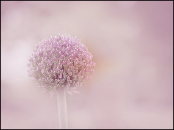
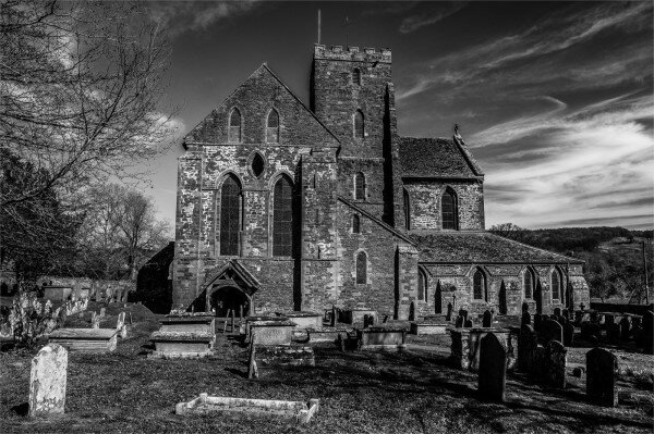

Open / Colour
Debra Godwin - 1 Acceptance
- Pink
Open / Mono
Angela Danby - 3 Acceptances (Including 1 Honourable Mention)
- ABBEYDORE
- CHECKING ON WORK IN PROGRESS - Honourable Mention
- PREPARING ENGINE 6998
Dave Houston - 1 Acceptance
- CYCLE RACKS
People - Mono
Dave Houston - 3 Acceptances (Including 1 Honourable Mention)
- COLLECTION BOX - Honourable Mention
- SOLO SAX
- SOUL MAN
Debra Godwin - 1 Acceptance
- CLOWN REVISITED
Travel – Scape & Architecture
Dave Houston - 1 Acceptance (Which was awarded an Honourable Mention Ribbon)
- LIFE ON THE LINE - Honourable Mention
Many congratulations to Dave, Angela and Debs

Club Success In MidPhot 2021
We are very pleased to share with everyone, that the club had 6 members achieving acceptances this year, with 20 images so a big well done to all who participated.
Angela Danby - 6
Mark Kemp - 5
Jay Hallsworth - 3
Debra Godwin - 2
Brian Swinyard - 2
Dave Houston - 2
If you’ve had any acceptances that you would like to share, then please let Jay know.
For those of you who don’t know, MidPhot is the anual exhibition for the Midland Counties Photographic Federation, of which our club is a member. The MCPF covers about 120 camera clubs in the midlands region, from Leek in the north to Abingdon in the south, and from Leicester in the east over to Long Mynd in the west.
Although the figures havn’t yet been released for this year, Last year, the exhibition had almost 3800 entries so it is no mean feat to achieve an acceptance.
We are very pleased to share with everyone, that the club had 6 members achieving acceptances this year, with 20 images so a big well done to all who participated.
Angela Danby - 6
Mark Kemp - 5
Jay Hallsworth - 3
Debra Godwin - 2
Brian Swinyard - 2
Dave Houston - 2
If you’ve had any acceptances that you would like to share, then please let Jay know.
Usually the exhibition is a mixture of print and projected images, however this year of course, due to the pandemic, it was entirely projected images in the following sections.
Open Colour | Open Monochrome | Nature | Scapes | Tryptych
Our successful entries were as follows:
Open Colour

Angela Danby - The Rep comes Calling

Debra Godwin - Gemma

Mark Kemp - Table For One
Open Monochrome

Angela Danby - Any Chance of a Lift 2

Angela Danby - Preparing Engine 6998

Brian Swinyard - Hand Among The Curves

Dave Houston - Peace in Mist

Dave Houston - Solo Sax

Debra Godwin - Man and Baby

Jay Hallsworth - Low Lighthouse At Burnham On Sea
Nature

Angela Danby - Brown Fur Seal

Angela Danby - Coming into Land - straightened

Angela Danby Harvest Mouse
Tryptych

Brian Swinyard - Are You Inspired

Mark Kemp - Forest Light
Scapes

Jay Hallsworth - Bamburgh Castle At Sunrise

Jay Hallsworth - Jetty In The Sea

Mark Kemp - Ice Trees

Mark Kemp - The Wave

Mark Kemp - Trees In The Snow
I’m sure you will all agree, there is some fantastic work from our club members, and I hope that this will inspire all of our other capable members to participate.
If anyone would like any further information about MidPhot, or indeed any other Salon/Exhibition, please do contact Jay
Please feel free to like and share this post on your social media and leave comments below.
PhotoEntry - Uploading Images For A Club Competition
In this post, I will walk though the process of submitting entries to Club Competitions using the new PhotoEntry system.
In this post, I will walk though the process of submitting entries to Club Competitions using the new PhotoEntry system.
Begin by browsing to the following address using your prefered browser (Chrome, Edge, Firefox, Safari etc)
https://compent.photoentry.uk/compent/
Note: There is also a link in the menu bar here on the club website.
You will first be prompted for your username (this is your email address) and password. (You should have re-set your password the first time you logged on - If you are not sure what it is, there is a Forgotten Password link that will send you a new password by email)
Click the Login button

Select the Competition Group - This is usually sorted by Season, however at present there is also a Test group for members to practice.

Here you will see all the available competitions for the season in one place.
Select the Competition that you are wanting to enter.

Here you can see the details of the competition, including the Status (Open, Closed, Judged or Future) The closing date, Your Class (Beginners, Intermediate or Advanced) How many entries are allowed and the desired dimensions for the images.
Click the Add New Entry button.

You are prompted for the Entry Title
Just enter the title of your image
Note: This doesn’t have to be the image filename - It is just how you want the image to be titled.
Then click the Add This Entry button.

Click the Choose JPEG button

A File Open dialog box will appear and you can browse to the image you wish to enter to select it and click the OK button.

Then click the Upload Image button.

Review your entry and if applicable you can click the Add New Entry button to repeat the process
Enter a Title for your next entry and click the Add This Entry button.

Click the Choose JPEG button again and browse to the file you wish to enter as your second entry.
Then click the Upload Image button

When you have added all entries, the page will say "You have reached the limit of entries in this competition"
Click the Show All My Entries button

Here you can delete the entry (with the Trash Can icon) or Edit the title (with the Pen icon)
You can also Re-Order the entries with the up/down arrows
Note: It is important to get your preferred image first because if we need to cull, then the last entry will not be used.
Once you are happy with your entry for this competition, click the link to the Competition Group at the top to return to the competitions - say to enter the Mono competition.

Once finished, you can then either click the Main Menu link to return to the list of Competition Groups or log out of the system with the Logout link in the top right

Resizing Images with GCCDPIPREP
The Gloucester Camera Club Digital Projected Image Preparation (GCCDPIPrep) program is a simple to use application written by Mark Kemp. In this post we will show how to use it.
The Gloucester Camera Club Digital Projected Image Preparation (GCCDPIPrep) program is a simple to use application written by Mark Kemp.
This program will resize your photograph and name the file correctly.
You can download it from here and install it on your windows PC.
Mark’s original help file is here:
You should have your image(s) ready to be renamed and resized. The application usually expects a JPEG format, but it will also accept a BMP, TIF, GIF or PNG file. RAW Files are not supported.
Here there is a single JPG file called "Boat House on Rydal Water" - You can see it's dimensions are 2400 x 1500 and is just over 3MB is size.

The first time you open the program, it will prompt you for your name. Type your name and click the OK button

If you have opened the program before, it will remember your name.

Click the Select an Image to prepare button and a the usual File Open dialog box will open.
Browse to and select the file you wish to process, then click the Open button.

The picture will display in the middle of the window.
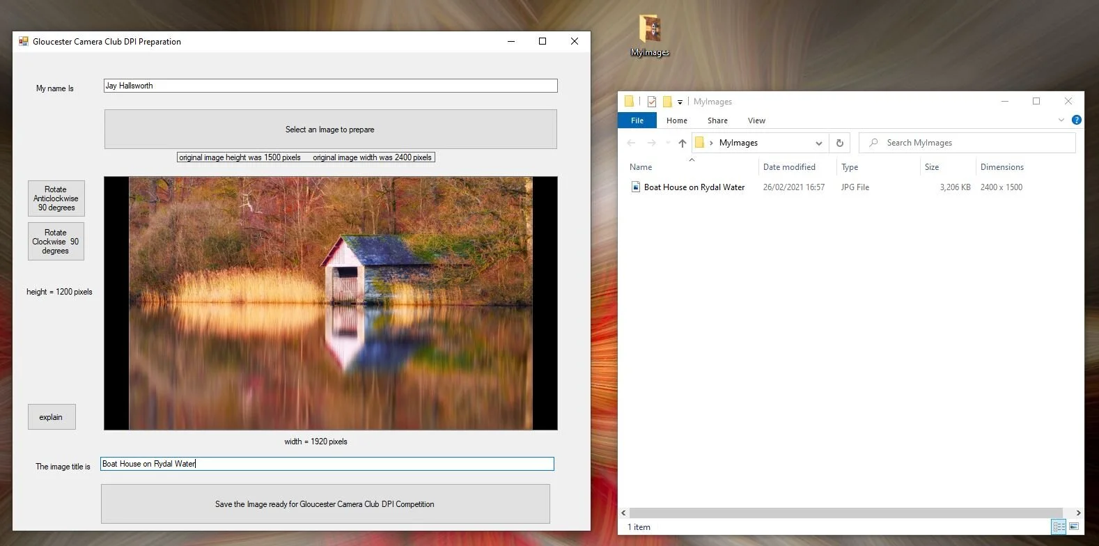
There are some notes about the original size and what size the new image is. It does not matter but if you are curious press the ‘explain’ button for the calculation
If the image is the wrong way up use the rotate clockwise or anticlockwise buttons to fix it.
Then enter the title in the box below the picture and click the large "Save the image ready for Gloucester Camera Club DPI competition" button to process your image.
A file save dialog will appear with the name of the file in the correct format and it will be the right size.
Click Browse to the location you want to save the file and click the Save button.

Your original file is not changed, the new file is formatted with the correct file name and you can see it has the right dimensions of 1920 x 1200 and is now only 424KB in size.

This is now ready to be given to the competition secretary.

Exporting Images At The Correct Size From Lightroom
In order to present images for digital display, particularly for Club and External competitions it is very important to select to correct resolution. The method of achieving this is different in various pieces of Editing Software. In this series we are going to look at three common ones, as well as a tool written by a club member, Mark Kemp.
Here I'm going to begin with Adobe Lightroom Classic
In order to present images for digital display, particularly for Club and External competitions it is very important to select to correct resolution. This ensures that your image will be correctly displayed on the display device being used.
In the case of our internal club competitions, our club projector has a native resolution of 1920 x 1200 - For external Salon's and Exhibitions this is very often different - For example Cheltenham Salon is 1600x1200, whereas Neath Salon is 1400x1200 and if you were submitting digital images for assessment to the RPS then the resolution would be 4096x2400 So first of all, be sure of the size of image you need.
Given our club's projector is 1920x1200, this means that the maximum width of your image can be 1920 pixels and the maximum height can be 1200 pixels.
The method of achieving this is different in various pieces of Editing Software. In this series we are going to look at three common ones, as well as a tool written by a club member, Mark Kemp.
Here is Mike’s post about Resizing in PhotoShop
Here is DaveH’s post about Resizing in Afinity
and Here is Mark’s post about Resizing with his GCCDPIPrep program.
In this post though, I’m going to begin with Adobe Lightroom Classic
Of course there are many ways to achieve the same thing, and if you use a different method, or setting, please do share your preferences in the comments sections below, but for this article, I'm just going to demonstrate one that generally works well for me. Here I'll begin with a landscape format image, then I'll repeat it with a portrait format.
Once your image is edited and complete, right click and select the Export option

The Export One File dialog box opens
- Ensure the Hard Drive option is selected in the Export To: field for base settings.

Expand the Export Location section, choose a Specific Folder as the Export To location and click the Choose button to browse to your desired location.
- Personally I store all my images in a OneDrive folder that's Synchronised to the cloud for backup. I have a folder for GCC_CompetitionEntries, and a Sub-Folder for each season. This is the location I choose, then I use the "Put in Subfolder field to create a new sub-folder for each round (say Round6 or GloucesterCup for example)

Expand the File Nameing - Here I have a saved preset called Camera Club so it always exports using our club format of Your Name%Photo Title but the new PhotoEntry system doesn't require this format and file naming is not important.

You don't need the Video options
Expand File Settings and ensure the Image Format is JPEG, Quality is 100% and the Colour Space is sRGB
- This is the default colour space that our projector uses. You may need to select a different option for other reasons like some Salons for example, or if you are sending the image to be printed at an external lab

Expand the Image Sizing section and since this is Landscape format where the width is greater than the height*, choose Long Edge and set to 1920 pixels. For Portrait format images where the height is greater than the width then you would choose Short Edge and set to 1200.
Also set the Resolution to be 96 Pixels per inch as this is the recommended resolution for on screen display. You may need other resolutions for other reasons (such as 300 PPI for Printed Images)
* This is a broad generalisation... Depending on the Aspect Ratio of the image, you may find that you still have to export Landscape format images using Short Edge = 1200 so it's always important to doublecheck your final exported images.

Personally I select Output Sharpening and select Sharpen For: Screen with the Amount: Standard

Other options are entirely optional, I leave defaults

You can then click Export button to save the image to the location that you specified and your work is complete.
Photo Salons & Exhibitions: Post 1 - What is a Salon and Why Bother?
This is a series of posts first published on my personal blog that will discuss some things I hope you will find useful, and encourage people to participate in Photo Salons. I very much hope that you find this, and other posts of interest, use and encouraging. Please do like and share this article using the links at the bottom
This is a series of posts first published on my personal blog that will discuss information about Salons & Exhibitions that I hope you will find useful, and encourage people to participate in Photo Salons. I very much hope that you find this, and other posts of interest, use and encouraging. Please do like and share this article using the links at the bottom
The posts in this series are:
Background
Following encouragement from Mike Watson, I entered a few Salons and Exhibitions over the last year. I only entered about 5 or 6 last year, but I've had several acceptances and even won a commendation ribbon in MidPhot and a Gold Medal in the Cheltenham Salon. It is something that we actively promote as a club, but there are at the moment only a few members I'm aware of that enter external salons and exhibitions (like June, Martin, Deb and Mike for example) I wonder though, if more people knew a bit more about these excellent opportunities to display their photos, they might consider and enjoy participating as well.
To that end, I thought I'd put together this series of articles to share my (albeit limited) experiences in the hope that it inspires other members to give it a shot.
I've written this in a very informal and personal tone in order to make it feel inclusive to all club member rather than just to the advanced workers. There are most certainly some members in the beginners class, whose photos that would do well in Salons. Therefore please don't think this is just something that the advanced members can aspire to.
Last year, Mike said to me, have a go and you'll most likely be surprised, and indeed I was… which is why I'm repeating that advice to everyone.
I guess initially, there are a few questions to be answered... So… First of all...
What is a salon?
Well, in short, it is a combination of a photographic exhibition and a competition. There are many, many salons and exhibitions worldwide and entering them can bring awards and distinctions. While there are many commercial competitions with tangible prizes that you may feel you might like to compete in to win things, these are often initiated by companies, to make a profit from and collect images for commercial gain. Salons however, are usually patronised by photographic bodies, and tend to be more for prestige and recognition rather than for prize gains.
These national and international photographic bodies include:
FIAP - Fédération Internationale de l'Art Photographique - https://www.fiap.net/en
PSA - Photographic Society of America - https://psa-photo.org/
GPU - Global Photographic Union - https://www.gpuphoto.com/
PAGB - Photographic Alliance of Great Britain - http://www.thepagb.org.uk/
BPE - British Photographic Exhibitions - http://www.britishphotographicexhibitions.org.uk/
While there are some salons and exhibitions, including MidPhot, that usually have print sections, with the Covid19 pandemic, most of these were cancelled so I only did Digital Images. There are also usually different sections that you can enter images in to. There are normally Open Colour and Open Monochrome Sections of course, but then there can be other sections with specific general themes and rules. These might include:
Nature - Which has strict rules on nature images like limited editing,
Travel - Obviously travel photos, showing the people and culture in the environment.
Creative - Which is for composites and digital artwork like we see from our particularly creative members like Annie Blick, Brian Swinyard, Deb Godwin, Mike Watson and John Bridgen, as well as the super work Suzanne Mellor shares in the Club Facebook group
Scapes - This can include seascapes, landscapes and cityscapes amongst other things.
This year, MidPhot has also included a Triptych section. A Triptych is THREE images that are related or tell a story or progression and placed on a background.
Why bother...
Well other than the feeling of accomplishment of having images accepted in to national and international exhibitions, and winning awards, medals and ribbons, you may have noticed people in the community (like Lee Sutton and Kylie-Ann Martin) with accreditations like EFIAP and BPE2. These accreditations, or distinctions as they are called, are gained by achieving acceptances in accredited Salons and Exhibitions. I'll talk more about these in a later post.
As mentioned earlier, each salon usually has many sections and each section can have multiple awards, Gold, Silver, Bronze as well as ribbons for commended and highly commended images. There are also often judges awards.
In addition many salons are patronised by more than one photographic body and so can bestow many awards.
For example, the Cheltenham International Salon of Photography (CISP) is affiliated with FIAP, PSA, GPU and the PAGB
Each salon can award a Gold Medal per section for each of these bodies, as well as various Salon Silver and Bronze medals in each section plus several ribbons for each body and section.
This generates for example over 140 awards in the Cheltenham Salon.
Although there are many entries to these salons etc, (last year in the Cheltenham Salon for example, there were almost 8000 photographic entries from over 650 entrants in more than 50 countries worldwide,) About 81% of entrants gained at least one acceptance, and 23% of all entries were accepted so don't be to concerned about the number of entries. You certainly have an equal chance and it's a real sense of achievement having your work recognised as being to such a high quality to appear in an international exhibition.
If you have found this post interesting and useful, please do comment below or like & share it.
The other posts in this series are:
Club Blog!
Here you can find useful help articles, items that were mentioned at the beginning of each meeting, plus other important announcements so you don’t miss any important news!
In this post, I will walk though the process of submitting entries to Club Competitions using the new PhotoEntry system.