
📸 Pixel to Print – Part 9: Printing with Lightroom
There’s something magical about holding a photograph in your hands—something you crafted, nurtured, edited, and now can proudly display. Whether you're hanging it in your hallway, framing it for an exhibition, or simply gifting it to a friend, a well-printed photo elevates your work from digital file to a tangible, lasting piece of art.
As photographer Jay Maisel famously said:
“Prints are the only way to hold onto a photograph.”
📚 Source: Jay Maisel - Light, Gesture, and Color, Peachpit Press
Why is Only Lightroom Classic Covered Here?
There’s a wide range of excellent software available today that can handle printing—from Capture One, ON1, and Affinity Photo to dedicated tools from printer manufacturers. Each has its strengths and unique workflow.
That said, it simply isn’t possible to be an expert in every printing application, and for the purpose of this blog and the needs of most club members, Lightroom Classic is the one I recommend and can confidently support. It offers a complete, intuitive workflow that integrates importing, managing, editing, soft-proofing, and printing all from within a single environment. So for those seeking a reliable, end-to-end pixel to print workflow, Lightroom Classic is hard to beat.
But, If Lightroom isn’t your chosen tool, that’s absolutely fine—many of the ideas and theory discussed in this post can still be applied to your software of choice. And if you’re using something different and need help, do reach out to others in the club—there’s a good chance someone else is using the same software and would be happy to help you translate these steps to your platform.
Using the Lightroom Print Module
Overview
To get started, click Print from the top-right module selector in Lightroom Classic. You’ll see a three-column interface:
· Left Panel: Templates and saved print jobs
· Middle Panel: Live preview of your layout
· Right Panel: All print, layout, and job settings

📸 Screenshot: SS1 - Full Lightroom Print Module interface with labeled panels.
Layout Styles and Image Settings (Right Panel)
Layout Styles
· Single Image / Contact Sheet: Ideal for printing one image per page or creating proof/contact sheets.
· Picture Package: Use this to print multiple sizes of the same photo on one page (perfect for headshots or portraits).
· Custom Package: Offers complete control—mix and match multiple images and sizes on one page.
Image Settings
· Zoom to Fill: Fills the cell with your image, cropping if needed. Useful for full-bleed prints.
· Rotate to Fit: Rotates the image to best fit the layout orientation.
· Stroke Border: Adds a line (black, white, or any colour) around each photo—great for separating the image from the background or mimicking a mount.
Layout
In the Layout Panel, you’ll set the structure of your print:
· Margins: Set the spacing from the edge of the paper.
· Page Grid: Define how many rows and columns you want.
· Cell Spacing: Space between individual cells/images.
· Cell Size: The actual size of the image print area.
🎯 Tip: Use inches or millimetres—whichever you're most familiar with when cutting mounts or framing.

📸 Screenshot : SS2 - Layout Styles, Image Settings and Layout Panels.
Print Job Settings (Right Panel)
This section governs how your image is rendered and delivered to the printer or file.
· Print To: Choose between Printer or JPEG File (for lab prints).
o If you are sending your image to an external lab, you would use the Print To File option
· Resolution: 300ppi is standard for fine prints. If unsure, use this setting.
· Print Sharpening: Choose Low, Standard, or High. Also pick your Media Type (Glossy or Matte).
· Colour Management:
o Profile: Choose your paper/printer ICC profile (often downloadable from paper manufacturers).
o Rendering Intent: See below for more information
· Print Adjustment: Here, you can manually increase or decrease the brightness and/or contrast of the print if it’s not quite to your taste.


📸 Screenshot : SS3a & SS3b – Print Job panel and ICC Profile Dropdown
Perceptual vs. Relative – What Do They Do?
Sometimes, your image file contains colors that your printer can’t reproduce exactly — especially if you’ve been working in a wide color space like ProPhotoRGB or AdobeRGB. These colors are said to be out of gamut (outside the printer’s range).
Lightroom gives you two options for how to handle those colors when converting your image for print: Relative and Perceptual. Each treats out-of-gamut colors differently.
Relative
Keeps all colors that can be printed exactly the same. Colors that are outside the printer’s range are simply clipped to the closest match.
➤ Best for images where color accuracy matters — like portraits, product photos, or clean graphics.
Perceptual
Shifts all the colors slightly (even the ones that are printable) so that everything stays visually balanced. This helps preserve the overall look and feel of the image, especially with saturated colors.
➤ Best for colorful scenes like sunsets, landscapes, or artistic images where preserving tone and harmony is more important than exact color values.
Which Should You Choose?
There’s no one right answer. If you're unsure, use Soft Proofing in Lightroom to toggle between them and choose the one that gives you the most natural-looking result in print.
Page Setup and Printer Settings
These two buttons access the same printer dialog, but with different outcomes:
· Page Setup (bottom left): Opens the print driver settings without printing. Use this to configure page size and paper type.
· Printer (in Print Job panel): Opens the same settings, but clicking OK will immediately send the print to your printer.

📸 Screenshot : SS4 – Print Setup and Printer Settings buttons
Things to Check:
· Paper Size, Orientation and Source: Match this to your printer and paper – You can either set these from the initial Print Setup dialog box or click the properties button and set from the Printer Properties dialog box.
· Borderless vs Bordered: Borderless gives edge-to-edge prints but can crop slightly.
· Paper Type: Always choose the correct type in your printer settings to match your paper. The paper supplier will advise you on their recommended settings for each of their paper products. See Part4 in this series for more information on this.
· Colour: Choosing B&W in this will usually produce a better, more accurate image, especially if your printer has dedicated “Photo Black” ink. However it can sometimes take much longer to print
· Presets – You can save different presets to speed up and consistently select settings. For example, you can have an A3 Portrait on Matte Paper in Colour and an A3 Landscape in B&W on Premium Semi-Gloss.
💥Hot Tip - Setting up presets for each paper size, orientation, paper type and colour type will take a little time initially, but will save you time in the long run and more importantly, allow you to consistently choose the right set of settings

📸 Screenshot : SS4b – Print Setup and Printer Properties
👌Pro Tip: Very often, the paper manufacturer will advise you to disable the printer from doing any colour management. This can be in different locations on different printers. For my Epson Et-8550 you go in to More Options, select the Custom radio button in Colour Correction. Then click the Advanced button and choose No Colour Adjustment
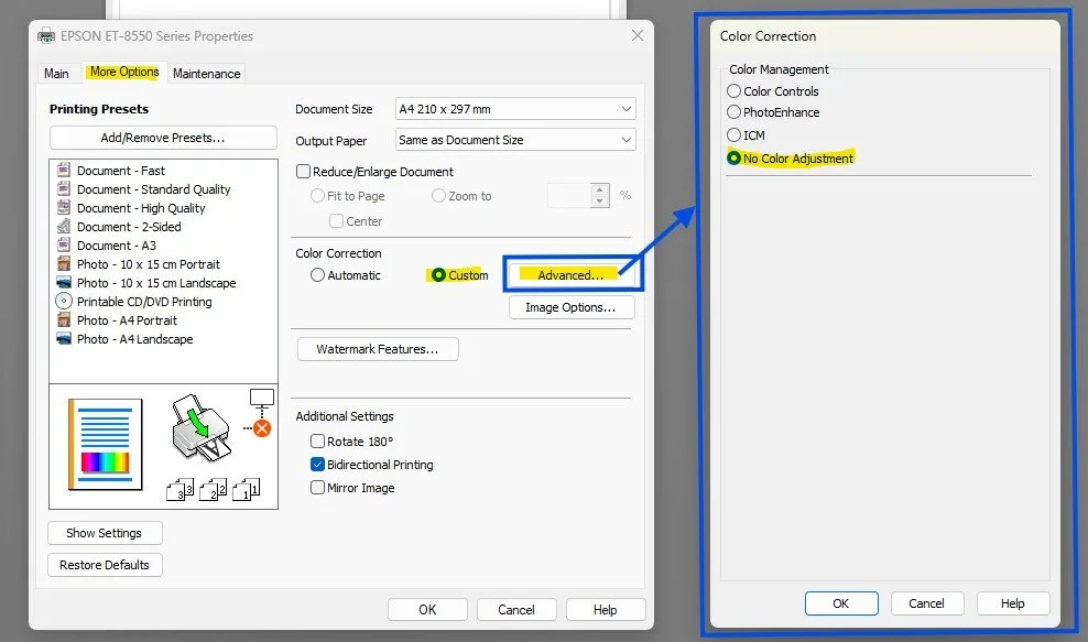
📸 Screenshot : SS4c – No Colour Adjustment
Additional Settings and Details
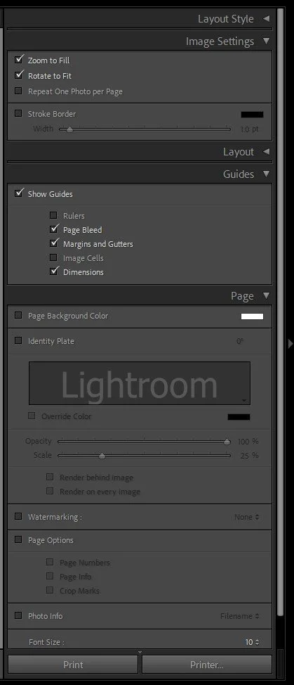
📏 Guides: Plan with Precision
Found in the Page panel, these are extremely helpful visual aids.
· Margins and Gutters: Show where the printable area ends. Essential to ensure nothing gets cut off.
· Dimensions: Displays the physical size of your printed image—hugely useful when cutting window mounts or planning mat sizes.
· Page Bleed: Shows whether any part of the image may be clipped in borderless printing.
🖊️ Watermarks, Identity Plates, and Photo Info
· Identity Plate: Add your name, a logo, or a title. Great for exhibitions or portfolio pieces.
· Watermarking: Subtle branding or copyright notice.
· Photo Info: Print metadata like filename, capture date, or custom text below the image—ideal for contact sheets or documentary prints.
You can resize and reposition these to suit your print layout. Just be sure they don’t interfere with the photo’s subject.
📸 Screenshot: SS5 – Additional Settings
Saving and Reusing Print Templates
To avoid repeating yourself every time:
· Save your setup as a User Template in the Left Panel. Name it something like "A4 Colour Landscape on Permajet GoldSilk " or "A3 Mono Portrait on Permajet FBMatt" with all of these settings configured appropriately. It takes a bit of time, but is well worth doing.
· Or use Saved Print Collections for a layout tied to specific images. These remember image selection and layout—perfect for reprints.
🛠️ Tip: Create a template for each of your common paper types, sizes and orientations. This speeds up future printing and ensures consistency.
🛠️ Action Step:
If you use Lightroom Classic:
Take 15–20 minutes to fully explore the Print Module. Pick a favourite photo and try printing a test image—A4 or 10x8 is perfect. Test:
· Layout styles (Single vs Custom Package)
· Zoom and Rotate to Fit
· Stroke Borders and Watermarks
· Print Sharpening and ICC Profiles
If you use different software:
Go through your own software’s print settings. Ask:
· Can I control image size and borders?
· Can I add sharpening and manage colour with ICC profiles?
· Can I print multiple images on one page?
· Can I add watermarks, metadata, or create templates?
Experiment, compare, and see how closely you can replicate Lightroom’s flexibility.
🔜 Next Up: “Wrapping It Up” – What to Do Next?
In the final post of our Pixel to Print series, we’ll bring everything together. You’ve edited, proofed, printed, and displayed your images—now what? We’ll explore your next creative steps, and how to keep your print journey going.
Keep printing—and see you next time!