
📸 Pixel to Print – Part 6: Paper Types – The Hidden Power Behind Your Prints
Have you ever looked at one of your favourite photos and thought:
“This looks great on screen… but something’s missing when I print it”?
That missing ingredient might just be your choice of paper.
Choosing the right paper isn’t just a technical decision—it’s a creative one. It influences the mood, emotion, and impact of your image far more than many photographers expect.
“The print is the final statement of the photographer’s intent.”
— David Alan Harvey, Magnum Photographer
📸 Understand Your Photography Style
Before diving into paper types, take a moment to think about your photography style.
· Bold colours, high contrast, dramatic light? → Try Glossy or Baryta.
· Soft, emotive, atmospheric images? → Opt for Matte or Textured Fine Art.
· A bit of everything? → Lustre or Satin finishes are great all-rounders
Understanding how you shoot—what you love to capture and the mood you want to evoke—can guide your paper choices from the start.
🧪 How Paper Affects Your Print
Paper isn't just a passive carrier of your image—it interacts with the ink and your photo’s characteristics.
Tone: Glossy and Baryta papers often deepen blacks and brighten highlights, giving your images a punchy feel. Matte and textured fine art papers mute highlights slightly, which can enhance mood or subtlety.
Contrast: Smooth papers tend to enhance contrast, while textured papers soften transitions between tones.
Texture: This adds a physical quality to your image. Smooth paper feels modern and clean, textured paper feels tactile and traditional. Choose based on the emotion you want your viewer to feel.
Try This: Print the same image on three different paper types and compare them.
A misty morning landscape might feel dreamy on matte but dramatic on gloss. Ask yourself, What are you looking to convey with your image, and allow that to guide your choice in paper.
📦 Manufacturers and Paper Ranges
There are a large number of paper manufacturers to choose from, and within that, each of the manufacturers have a varied choice of Matte papers, of Glossy papers and of Luster paper - so which do you choose for a given image? Well, there isn’t a right or wrong answer to be honest. It’s very much a personal perference.
Start with these brands:
Hahnemühle – Renowned for fine art and cotton-based papers
PermaJet – A UK favourite with a huge range and great value
Fotospeet – Another UK favourite In The Camera Club Community
There are others of course, you can buy cheap paper from amazon as a fraction of the cost of some of the offerings that these manufactuers provide. And if you feel you get good results, then great, I’m pleased for you. But these are well known and generally well renowned for quality, service and choice. I have personal expereince with each of these, and while I have my personal preferences, I would be happy printing on any of these.
Another alternative is using paper designed and branded by your printer manufacturer. These will often yeild good results as they are designed with subtle nuences that are particular to that brand of printer.
Manufacturers usually have a selection if papers of a similar class - For example. Permajet’s range of Lustre type papers is considerable.
Oyster 271
Smooth Pearl 280
Photo Luster 3310
Ultra Pearl 295
So, which do you choose? Well, as with the choice of manufactuers, it is very much personal preference. If you have a keen eye, then you will find that there are very subtle differences between them. These might include slight differences in paper weight, the surface detail, and the base white point.
So really you have to experiment with the papers. Think about going along to a workshop or open day that the manufactuers often run. These can give you the opportunity to learn about the range of papers and bring in a couple of images to do test prints of for you to compare. Manufactuers also often provide a swatch book with small samples of each of their papers. You could use this as a quick reference to remind myself of what each looks like before I buy a new paper type.
By far the best way to try out papers is to buy sample packs. Most manufactuers will do this, and include a couple of A4 sheets from each of their ranges. Permaject for example have test packs for their ranges
Test Pack 1 - Digital Photo
Test Pack 2 - FB Baryta
Test Pack 3 - Fine Art
Test Pack 4 - Double Sided
They also do a Heritage Range Discovery pack.
You can browse their websites for sample packs, or check with your local lab or print supplier.
Order a media swatch book to physically handle each paper type and see how it reflects light.
For general photo printing, try the PermaJet Test Pack 1 – Digital Photo is a brilliant starting point. It includes a wide range: Glossy, Lustre, Matte, and even a Metallic paper for you to experiment with.
When using test packs, I select a couple of images that I feel might work well on a given paper type, and print them 2 per A4 page on each of the papers - I can then compare and contrast the paper I prefer and go on to purchase - Don’t forget of course to use the correct ICC Profile and printer driver settings.
📄 Glossy, Lustre/Satin, Matte, Baryta, and Fine Art – What’s the Difference?
Glossy
High-shine and punchy, glossy papers are fantastic for bold, colourful images. Think saturated landscapes or vibrant street photography. They produce deep blacks and rich colours but are prone to fingerprints and glare under glass. People who are new to printing often go for this class of paper, remembering back when Glossy meant premium, but it can be very marmite. I use glossy paper with caution. Very few of my images work well on glossy paper, and those that might, I would tend to go for a Baryta for a rich, quality feel.
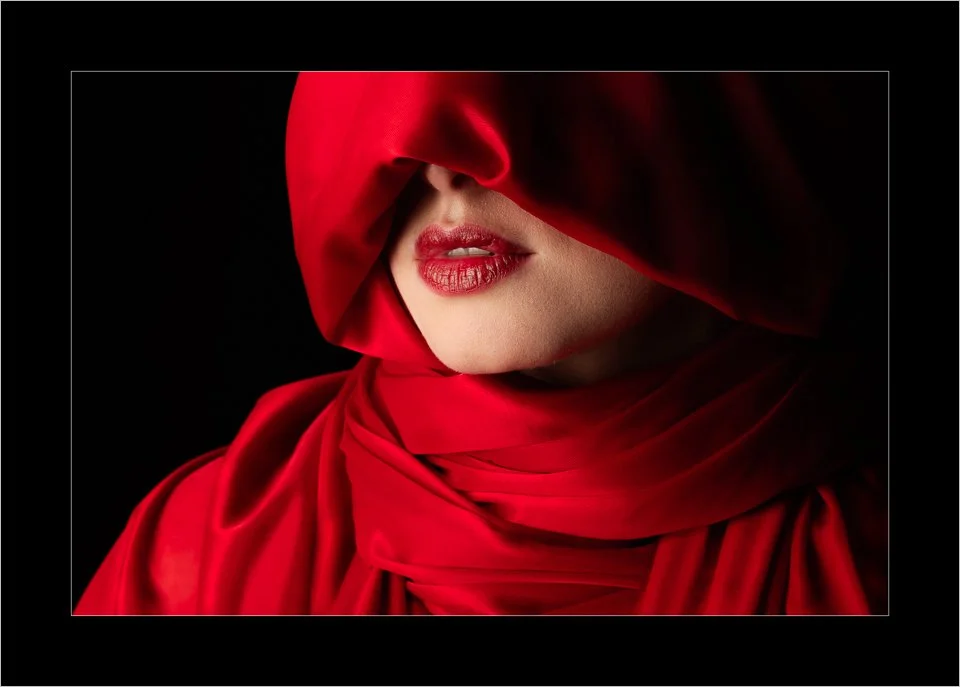
This one however I feel does. It’s a portrait with bold colours, the shiny material and lips lend themselves to a more glossy paper. The paper I actually tend to use for this is Permajet FB Royal Gloss 310
Lustre/Satin
A perfect middle ground. Lustre or satin papers have a slight sheen without the full gloss effect. They hold contrast and colour well while being more forgiving of reflections. Great for portraits, events, and general-purpose printing. This type of paper should be your go to paper when first starting out printing. It’s not always going to give you the very best results, but untill you can develop your expereince and build up your informed preferences it’s very much a safe choice. I tend to print my nature based work on this kind of paper. For example, this photo of dolphins, I choose the Permajet Smooth Pearl 280 This image has strong colors, but it’s not punchy and bright, it’s gentle and muted. This particular one may work on a matte paper, but I perfer the lustre.

Matte
Velvety and soft, matte papers give your images a more subdued, artistic feel. Ideal for subtle tones, fine art images, and black & white photos. They reduce glare completely but can flatten contrast slightly. I often choose a matte paper for my high key portraits that are soft and gentle like this one. A textured fine art paper is a tempting choice, but not in my opinion a good one because the smooth skin tones would be impacted by the texture of a strong paper, so I usually choose to print this on FB Matt 285

Baryta (pronounced "bah-ree-ta")
A nod to traditional darkroom prints, Baryta papers have a smooth surface with a slight sheen and a deep, rich tonal range. These papers often bring a rich, high-quality feel to prints but tend to be more expensive than standard photo papers—well worth considering for your best work or exhibition prints.
This image has deep blacks and high dmax. It could work on a glossy paper, but a luxurious baryta paper give it a realy rich, quality feel so I choose to print this on FB Gold Silk 315

Fine Art (Rag & Textured Papers)
These are usually matte papers made from cotton or alpha-cellulose, often with a rich texture. Think Hahnemühle Photo Rag or Canson Aquarelle. They lend a painterly quality to images and are perfect for moody, contemplative, or vintage-style photographs.
This image, although has soft smooth skin, also has a texture overlay and grain so it works well on fine art paper. I usually choose to print this on Portrait White 285 which has a gentle texture

Speciality Papers - There are a number of perculiar papers out there. Very heavy textured canvas, or a leathery sheen perhaps might suit a particular image. They should be treated with extreme caution though. Lets think about Metalic paper for example. These have a colourful sheen to it that can be very marmite. Its either loved or hated. For the right image, I love it. Images of metal objects such as cars can work well - think an old classic american muscle car in Cuba. Also monochrome and images with lots of water can look very nice on this type of paper. An example of an image that I would print on metalic paper is this one. It contains lots of naturally shiny surfaces like the glass in the shard and the water. It is also being a monochrome, it has lots of steely greys which can often sit well on this paper.

🎯 Summary Tips on Choosing the Right Paper for Your Photo
Here are some practical ways to match your image with the perfect paper:
🖼️ Match paper to mood
· Dramatic and high contrast images → Glossy or Baryta
· Soft and emotional images → Matte or Fine Art
· Everyday versatile use → Lustre or Satin
🔍 Use test prints
Print postcard-sized versions on different papers to compare the effect before committing to a large or final print.
🧰 Build your personal ‘arsenal’
If, like me, you shoot a wide range of subjects, I recommend choosing three go-to papers:
· One Glossy for punchy colour
· One Satin/Lustre for general use
· One Matte/Fine Art for subtle tones and classic styles
This gives you a flexible but focused selection to start your printing journey.
🌑 Low key vs. high key images
· Low key images (deep shadows, dramatic light) often look best on Glossy or Baryta papers that preserve shadow detail and depth.
✅ Tip: Avoid printing very low key images on matte paper. Matte finishes can crush blacks and leave your photo looking flat or washed out.
· High key images (light, bright, soft scenes) often suit smooth matte papers that maintain subtle tonal transitions.
⚠️ Specialist papers—use thoughtfully
Metallic papers can wow a viewer—or horrify them. They’re best used sparingly and with care. They work well for:
· Chrome or metallic subjects like cars
· Reflective scenes like water
· High-contrast monochrome images
They can create dramatic results but may not always be well received in competitions or exhibitions. Use them for the right image—and expect strong reactions.
🛠️ Action Step: Explore Two Paper Brands
Your challenge this week is to explore the paper offerings from two leading brands:
1. Hahnemühle – Industry leader in fine art printing
2. PermaJet – UK-based, with accessible and diverse paper options
Head to their websites and browse the Glossy, Lustre, Matte, Baryta, and Fine Art categories.
Make a note of any papers that catch your eye—think about how they'd work with your style of photography.
Look into ordering a media swatch to handle papers and see finishes first – I’d suggest doing this if you own a printer or not!
If you have your own printer, try getting a test pack like PermaJet’s Test Pack 1 – Digital Photo to trial multiple finishes, including metallic
🔜 Next Up: Presenting Your Prints
Once you’ve picked the perfect paper and made the perfect print—how should you make sure it looks right when you print it off?
In Pixel to Print #7, we’ll explore how to handle colour management, talk about ICC Profiles and use Soft Proofing